Showing posts with label Painting Tips. Show all posts

Friday, 22 June 2018

Star Wars AT-ST [WIP - Base depicting a clearing in Forest Moon of Endor & Weathering the Footpads]

In this final Star Wars AT-ST work-in-progress post, two significant processes are dealt with namely creation/painting of the base and weathering fresh mud effects on the scout walker's footpads. Completion of both means the walker is essentially completed and ready for its unveiling. But before the AT-ST is seen in its finished state, here's a look at how a base depicting a clearing in the Forest Moon of Endor was created and how its footpads were weathered to blend into the base.

Bandai Star Wars AT-ST work-in-progress: Base and Final Phase of Weathering

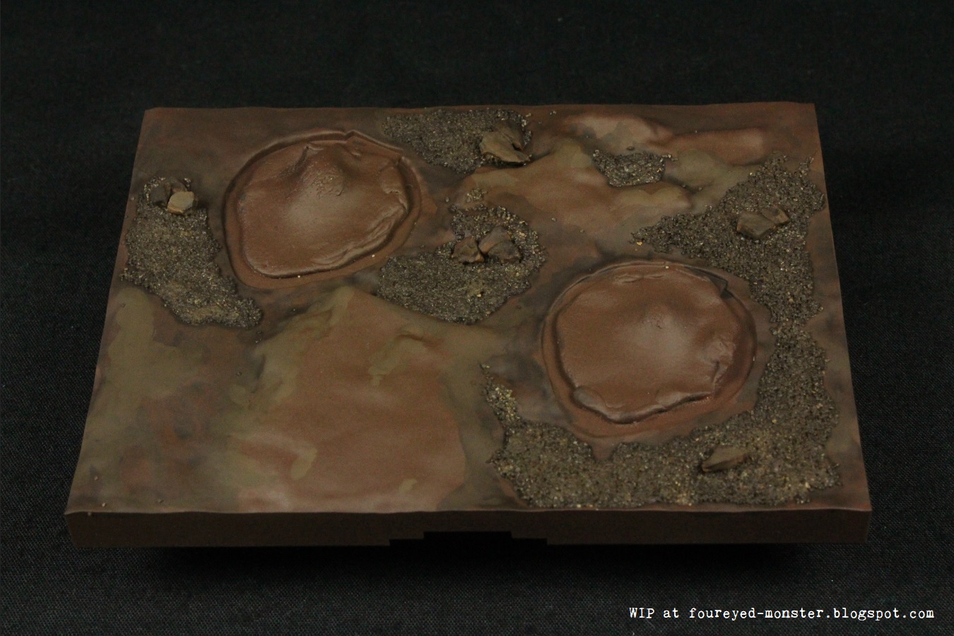
To recreate conditions approximating how a clearing in the Forest Moon of Endor might look like prior to having its soil turned into fresh mud, I used common basing materials such as modelling sand and stone, generic all purpose (or white craft) glue as well as two tones of spray paint i.e. Tamiya TS-1 Red Brown and TS-69 Linoleum Deck Brown. Below is a step-by-step process of how the base came together to reach a completed 'dry state' before it was given an additional mud weathering step.

Materials used to create foundation of the base: sand, stones, wood glue and two tones of spray paint
Base after sand and stones are glued onto base with two dark brownish hues of spray paint
Greater tonal variation on base is achieved using Vallejo Model Color acrylic paint
Base after layering in Vallejo Model Color colors of Black Brown, Burnt Umber and US Field Drab
Bright green 'grass' was glued onto the base using wood glue
Closeup of the base prior to the final mud weathering

With the 'dry state' of the base completed, all that was left to do was to remove the adhesive tacks placed onto the male joint connectors. These sticky tacks help protect the joints from being coated with paint which in turn prevents any eventual fitting issues when the AT-ST's legs are fixed onto the unmasked areas. As you can see below, the chicken legs were seamlessly attached to the joints.

Removal of the adhesive tack covering the joints onto which the footpads will eventually connect
Footpads of the AT-ST after they had been connected securely to the base

Why did I choose to depict a clearing in the Forest Moon of Endor? Primarily it was because I didn't have the basing materials needed for a proper recreation of the flora in Endor or what is actually the giant redwood forests of northern California. But luckily for me, the clearing located outside the shield generator bunker - as seen in Return of the Jedi (see below) - looked very similar to a generic grass and soil combo. So much so that I could use the materials I had at hand to recreate it.  

Clearing near the Imperial Army's shield generator bunker on the Forest Moon of Endor
Ground flora on the Forest Moon of Endor comprised largely fern-like vegetation

Meanwhile, further work on the base in its 'dry state' involved the application of an enamel-based weathering product i.e. AK Interactive Fresh Mud. The method of application involved spraying bursts of air at a hand brush loaded with the enamel paint thus causing the 'fresh mud' to splatter onto the footpads. White spirit was used to clean up excess 'mud' to prevent over-weathering. Results of this final (fifth) phase of weathering can be seen in the last three photographs below. 

Materials used in the final phase of weathering for the AT-ST
Footpads of the AT-ST and the base, after mud weathering
Mud weathering was applied by blowing air (via airbrush) at a paint brush loaded with enamel paint
Enamel 'mud' paint was also applied onto the base to achieve overall uniformity
Color used in weathering the footpads are akin to fresh mud hence the darker brownish hue

Soon enough the Bandai 1/48 scale AT-ST project will conclude. And while I contemplate what my next Star Wars project is going to be, I plan to keep busy with the MENG King Tiger assembly as well as take tentative steps in airbrushing skin tones with a better airbrush. In the meantime, I hope you enjoy a productive weekend ahead hobby-wise. Cheers and see you next week!

http://shireworks.blogspot.com/p/custom-painted.html

Wednesday, 15 July 2015

Beware an optical illusion's effect on your paintings and drawings

Your eyes are deceiving you! In 1995, an optical illusion published by Edward H. Adelson, a Professor of Vision Science at MIT, drew attention to the fact that our eyes perceive how light or dark an object is based on the lightness or darkness of its neighbouring objects. If you are seeing the illusion below for the first time, you would probably call me crazy if I told you that Square A and Square B have the exact same tonal properties. But they actually do as the subsequent picture shows.

The checker shadow illusion as published by Edward H. Adelson, Professor of Vision Science
When cut out and placed next to each other, the squares A and B are found to be of the same shade

This illusion has implications on our artwork be it paintings or drawings. In essence, the checker shadow illusion highlights our visual system's weakness at being a physical light meter. I believe the same principle is roughly at work when a colour that we paint on our miniatures can sometimes look noticeably different based on which other colours are surrounding it. To illustrate my point, I made a skin tone comparison between the Nocturna Models Le Petit Chaperon and Akelarre Enchantment figures. At first glance, one can arguably assume that the former has a slightly brighter skin tone.   

A light skin tone on the finished Nocturna Models Le Petit Chaperon
A seemingly duskier skin tone on the work-in-progress Akelarre Enchantment

However, upon closer inspection - and when the surrounding colours are removed as to negate their influence - it would seem that the latter i.e. work-in-progress Enchantment figure is the one with the much lighter skin tone. Her skin's seemingly dusky undertones are more apparent when viewed next to her light turquoise dress. Similarly, Le Petit's skin tone is made lighter by the darker contrasts of her red cloak and blue corset. As control, both figures were photographed under the same condition.

Putting both the Nocturna Models miniatures side-by-side for a skin tone comparison
Comparison between skin tones sans surrounding colours

Such optical illusions are more noticeable when drawing with graphite pencils because we are dealing with a gradation of only two colours namely black, white and the resulting grey hues in between. Looking closely at my drawing below, you might notice the highlights/reflected light on the ala (or wing) of Park Joo-Mi's nose looks as bright as the highlights on her left cheekbone. But as the following edited picture shows; this is not the case at all. The illusion is caused by the wing of the nose being located next to the dark shades of the nostril which makes the reflected light look much brighter than it really is. And this illusion caused an error on my part: Highlights on the bridge of her nose have the same tonal value as the wing of the nose when the former should have been brighter. Inconsistencies such as this are among the kinks that I need to iron out before I can improve further.

Finished portrait drawing of Park Joo-Mi
Optical illusion showing reflected light on the ala (or wing) of the nose is darker than it actually looks

My suspicion of this phenomena was first confirmed in a National Geographic Channel show called Brain Games and reaffirmed when I came across this brilliant YouTube video by JD Hilberry. I would strongly advise you watch both sources to better understand how this optical illusion can effect your paintings and drawings. Just being aware of the problem has been a real eye opener for me. Hopefully, this post can bring a similar awareness to those of you who do not yet know, or those that do but just can't quite put your finger on what you may already instinctively know. Either way, may this little bit of information help you as much as it has helped me in my quest to create better art.

http://shireworks.blogspot.com/https://www.facebook.com/shire.works

Saturday, 3 January 2015

Nocturna Models Enchantment [WIP - Adding neutral colours and expanding soft colours on the clothes]

Work on my Game of Thrones interpretation of the Nocturna Models Enchantment 70-mm resin miniature is proceeding at a painstakingly slow pace with the addition of a neutral colour and expansion of the soft colours to strategic locations in her clothing. But I wouldn't want it any other way because each step I take has a reason and also sets the tone for the subsequent layers of paint. While contrast in the lightly coloured clothing has been intentionally kept low, darker shadows and brighter highlights are still in the works (if needed) once her skin tone and dragon have been painted. 

Nocturna Models Enchantmet, work-in-progress with the colour scheme for her clothing slowing taking shape
A neutral greyish/greenish brown was added to complement the soft colours
Soft colours were expanded to the rest of her clothing at strategic locations

Addition of the greyish/greenish brown neutral colour served a two-fold purpose. Firstly, I felt that it added a bit of 'grit and determination' to balance out the largely pastel colours which are meant to portray the more feminine and soft side of Daenerys Targaryen, the character I am basing this paint job on. In my interpretation, the greyish/greenish brown hues symbolizes the barren and dry areas that Daenerys finds herself in while she is transitioning from a powerless pawn into the Khaleesi and a powerful leader in her own right. It's a dichotomy alluding to her strength as well as compassion.   

Light turquoise hues were applied on her head gear
Pinks hues were added to straps around both arms
Green hues expanded upwards to the neck and downward to the knees (not visible here)

Meanwhile, I finally decided which soft pastel colours went where on the rest of her clothing - light turquoise on her headgear; more pink on the straps of both her arms; and green on the neck lace thingy as well as skull icons at the knees. Overall, both the green and neutral colours were spread to the top, middle and bottom portions of the miniature. Turquoise is found on top and middle portions while pink is on the middle and bottom portions. Clothing accessories remain unpainted for now. 

If required, additional contrast on her clothes will be added once the dragon and her skin have been painted
Light colours on her clothing ensures focus will inadvertently shift to the dragon and her skin/face
A range of acrylic paints used for the neutral colours

Taken in isolation, the existing low contrast and light pastel colour scheme admittedly looks dull. But I am looking at things two to three steps ahead when the skin, dragon and clothing accessories have been painted. Hopefully by then, things will make more sense to the viewer. It's actually something I have learned the hard way. Early on in this hobby, I tended to over-correct myself in the initial stages of painting only to redo the original scheme once the other parts have been painted in. The way each colour is viewed changes when another is placed next to it - something to keep in mind as you paint. Well that's it for my first post of the year. And here's wishing you a very good year ahead!

http://shireworks.blogspot.com/p/nocturna.html

Thursday, 20 June 2013

Testing the Waters (Part 1/2) - Laying the groundwork for making water in a diorama

One vivid childhood memory I have was of me walking into a small hobby shop and being awe struck by the many World War II dioramas on display. One particular diorama grabbed my attention and just wouldn't let go because the modeller had constructed realistic looking water as part of the scene. To a little kid with no knowledge whatsoever of the hobby, the thought that something like that could be done was simply mind blowing. Now three decades later, I am having a go at simulating a still water scene for a mini diorama which might be used for some miniature projects in the future.


IKEA Heat - Pot stands made from cork, which form an ideal base for the mini diorama

Firstly, I cut out a section from IKEA's cork pot stand for use as the base for my mini water diorama. Using a pencil, I then outlined the fringes of what will be a small pool of water (more of a pond or hot spring) before carving out a shallow hole with a hobby knife, up to a depth of about 5 mm.  

A section of the cork was cut off and then a shallow hole was outlined before being dug out using a hobby knife

Following this, I added some bits and pieces of scenery comprising smooth pebbles into the floor of the pond/hot spring while laying more jagged edge rocks on the edges. I also used pieces of the cork to create two rock bases on either side of the pond/hot spring as well as add sand on the flat areas.

With all the pieces glued on, it was ready for paint
For the basecoat, I used a mixture of Chaos Black:Adeptus Battlegrey on the rocks and surrounding land area while Skull White was applied on the pond/hot spring. Both the rocks and land area were then given two coats of drybrush i.e. Codex Grey followed by Fortress Grey. Meanwhile, an additional step consisting of a Devlan Mud wash was applied to the land area.

Aiming for a huge contrast in the basecoat application
A combination of drybrushing and washing techniques

Next up was the colour scheme for the water. There was a lot of experimenting done before I finally decided to opt for greenish looking water to stimulate either a still pond or hot spring with algae. To achieve this effect, I mainly used three Citadel colours namely Dark Angel Green, Hawk Turquoise and Scorpion Green. A couple of layers comprising a mixture of Hawk Turquoise with a little bit of Scorpion Green was then applied on top of the Skull White in the water section.

Possible acrylic paint colours for depicting water in a miniature diorama
Basecoat for water

What I was trying to achieve was a hot spring water effect in which geothermally warmed water was seeping out from the deeper end on the right side, and flowing towards the shallower end on the left side. Hence, I painted a transition of darker to lighter colours from right to left. Hawk Turquoise was the main colour with Scorpion Green added to stimulate the shallow end while Dark Angle Green was added to stimulate the deeper end.

Paint job completed and mini diorama is ready for the next step - epoxy resin

In hindsight, I should have added more green to the overall colour scheme. Definitely something to consider for future attempts at painting realistic water. With the paint job completed, the next step involves the use of chemicals to stimulate the actual body of water. That will be covered in Part 2.

Click on this link to go to Part 2.

Friday, 24 May 2013

Salvaging sanity from a moment of madness

In my previous attempt at painting up a Kingdom Death miniature, a bad chalky and powdery white undercoat meant that subsequent paint layers were a challenge to lay on smoothly. While the final result was better than I expected, it was still not what I was aiming for. With that weighing on my mind, a moment of madness saw me taking a hobby knife to the second Kingdom Death miniature that I was painting - the Pinup Saviour - in order to scrape away the undercoat as well as initial layers of skin tone I had applied up to that point. Try not to wince when checking out the following photo.

Early stages of the butchery done with my hobby knife

It started harmlessly enough with me thinking that I could smooth out the rough paint texture by lightly and carefully scraping the hobby knife over the painted areas. Soon enough, some frustrated flicks of the hobby knife saw even the white undercoat paint coming off thus displaying the plastic beneath. The madness soon took over as I found myself using the hobby knife to take out nearly all the paint from the miniature. I tried to salvage the situation by painting a light undercoat comprising a mixture of Chaos Black and Skull White (see below) but it just didn't feel right.

Even more damage to the Pinup Savior

Pleading ignorance wasn't an option as more seasoned hobbyists had advised putting the miniatures in a Dettol-Water mixture to remove the paint without damaging details. But at that moment of uber craziness, it never crossed my mind to use the antiseptic disinfectant. After a lot of hands-on-the-head moments, a semblance of sanity prevailed and out came the Dettol. I decided to put another early work-in-progress miniature of Gandalf into the mixture as it also had a badly applied undercoat.

Gandalf the Grey has a case of chalky and powdery white undercoat
Both the Pinup Saviour and Gandalf were dumped into a mixture of Dettol and Water

Luckily enough, I stumbled across a very good guide on using cleaning products to strip paint from a miniature on an online forum. As Gandalf only had a light coating of Skull White spray, it took just a few hours of soaking in the mixture before some scrubbing with an old toothbrush removed all the white undercoat. In comparison, the Pinup Saviour needed to be soaked overnight to remove about 95% of the paint. Some stubborn paint layers embedded into small crevices could not be removed. Sadly, some scratch marks were obvious due to my butchery with the hobby knife.

White undercoat removed easily using the Dettol-Water mixture
With most of the paint removed, the Pinup Saviour did not escape unscathed with her left hand breaking off the main body

So with paint successfully removed from both miniatures, the next task was to find an alternative primer/undercoat spray. While I think the Citadel Skull White spray-can is still perfectly usable for miniatures painted to table-top quality, or even beyond especially when applied in very light coats, I have found results too varied especially in the hot and humid weather where I am at.

That being said, the Citadel Chaos Black spray-can is still by far the best black undercoat spray I have used to date. But if I am going for a lighter undercoat, I now mostly use the Tamiya Fine Surface Primer (Light Gray).

I have observed experienced painters using the undercoat/primer spray-can in two ways i.e. either applying an extremely light "dusty" coating of the undercoat/ primer - sometimes just one to two passes of the spray can on each side of the miniature, OR applying a light even layer of primer/undercoat which involves perhaps up to five passes or more. I decided to go the middle path of somewhere in-between.Which of the two (or three) methods above gives you the best results?

Gandalf primed with the Tamiya Fine Surface Primer
Kingdom Death Pinup Saviour primed with the Tamiya Fine Surface Primer

Lessons learned from this undercoating/primer mishap:
1.Spending more time prepping a miniature is always a good thing, even to the extent of going back with your hobby knife to remove mould lines that become evident after an initial light primer coat.
2. Never underestimate the importance of a good undercoat or layer of primer. Your future layers of paint will thank you for it.
3. When you are itching to slash and butcher your mini with a hobby knife, take a deep breath and step away. After a short time away from your mini, you would be able to think more clearly.

That's my misadventure for the week. Hopefully the hobby gods are treating you more kindly.
Related Posts Plugin for WordPress, Blogger...