Wednesday, 19 August 2015

Ork Painboy [WIP - Skin, eyes and pants] & An Ode to the Gods of Chaos

Neglected and gathering dust, the Warhammer 40K miniatures in my collection remind me of the toys in Toy Story, only worse .... much worse. Some lie primed and abandoned, others half assembled without even a primer coat and yet more lie NIB (new in the box). Sick of the situation, I've decided I had better start doing something about it. So as a new beginning, the Ork Painboy is now back on the painting table while I'm gathering ideas on colour schemes to use for my ode to the gods of Chaos.   

Ork Painboy work-in-progress on its head: skin and eyes
Skin colour limited to Citadel Orkhide Shade, Knorloc Green, Gretchin Green ...
... and a wash of Citadel Athonian Camoshade to tie them all together

For the Ork Painboy, I will be painting it from the inside out. Essentially what this means is painting will start from the deeper niches of the miniature to the outer layers and from the central axis (torso and legs) towards the outer limbs (both arms and their respective implements). And to keep from being overwhelmed by the Painboy's many small details, they will be painted one section at a time.  

Colours inspired by a certain great noble house of Westeros
Bright orange PVC pants, the kind only an Ork can pull off

To prevent the Warhammer 40K projects from getting stale, a slightly different approach had to be taken especially towards colour schemes. Previously, I would assiduously research the White Dwarf magazines and respective army codices to get the colours exactly right. Well, no more. Priority would lie in creating (hopefully) pleasant colour combinations. Some leeway will be given to at least getting the clan or chapter emblems correct. But in the end it will be as it should be, all about the colours. Why else would the Ork Painboy suddenly sport a garish and supremely bright orange PVC pants.

An Ode to the Gods of Chaos   

Chaos Space Marines soon to be dedicated to (from left) Nurgle, Slaanesh,Tzeentch and Khorne
All the miniatures are from the Dark Vengeance starter set

If colours are the whole point then the Chaos Gods have a whole kaleidoscope of them. From the sickly greens of Nurgle to angry reds of Khorne and mysterious blues of Tzeentch as well as sadistic purples of Slaanesh. That's going to be difficult but fun. There is that. To make this possible, four Chaos Space Marines from the Dark Vengeance set will be used. Only time will tell if attempts to kick start my Warhammer 40K project will take hold. Four chaos marines and an ork will be the first step.

Wednesday, 12 August 2015

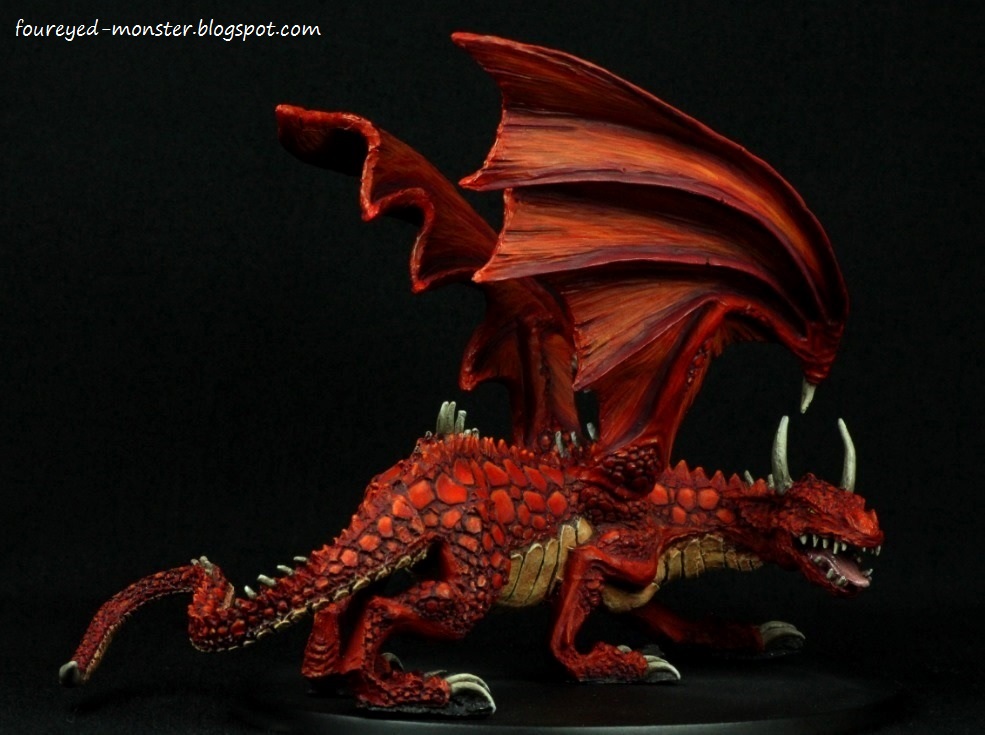
Red Dragon [Completed sans base]

Finally ... an iconic fantasy piece is now part of my personal collection. Painting a red dragon was a non-negotiable item in my must-paint-checklist. If I ever were to visit a hypothetical museum display of all things fantasy, you can be sure that uppermost in my mind would be where is that red dragon?  

A mythical selfie ... even dragons are jumping into the social media bandwagon

Initially, I was sorely tempted to paint a less cliched mythical beast, say perhaps a chameleon dragon with hues ranging from green to purple. Apprehension had clouded my thoughts as to how I could ever pull off a colour scheme that was overwhelmingly dominated by a single hue. So for inspiration I looked towards Larry Elmore, a fantasy artist whose works graced the covers of many a book in the genre (Dragonlance as well as Dungeons & Dragons to name a few) that I had read as a child.       

Red Dragon [Completed sans base]
Light ochre, beige, white, purple and pink were used to contrast the reds
Red, red and more red

Using Larry Elmore's dragon illustrations as the foundation to work from, I also referenced more contemporary takes such as the movie version of Smaug as well as mother nature's Scleropages legendrei (super red arowana) and Naja pallida (red spitting cobra). Placed into a melting pot of ideas, these references then gave rise to the colours I used to contrast the dominant red scheme. Some more noticeable than others, they consist of light ochre, pink, purple, beige, white and yellow. 

For a slime-like effect, a light coat of gloss varnish was applied to the tongue
Wings were painted with near yellow highlights to make them stand out from the rest of the dragon

There is a good reason why this piece doesn't have a base yet. And it's not the usual 'I suck at bases' excuse. The existing oval base will eventually be discarded for a larger and more elaborate base once I have thought of a suitable diorama. Moreover, the antagonist (or protagonist depending on your view) for the dragon remains undetermined. While the Kingdom Death Pinup Savior was an early favourite for the role, she is no longer suitable because her paint job is simply not up to par. It's likely another Kingdom Death girl will take her place, either one that has been or has yet to be painted.

One of the more dynamic viewing angles
Side view facing away from the dragon
Dragon sits atop a soon to be discarded bare-bones oval base

If there is one thing I might consider doing differently, it would be to paint the dragon's wing membranes to a hue as light as its underbelly. But in the end I loved the classic look better. 

Top view of the dragon in which light effectively catches the brighter highlights on both wings

One of the marks of a great artist is that he or she inspires others to mimic and improve upon their work. Larry Elmore does all that and more. This dragon is as much for myself as it is an ode to Mr. Elmore whose works sucked me into the world of fantasy. Don't judge a book by a cover they say. Meh! Dragons on the cover opened the door to a wonderful world of fantasy and I'm the better for it.


http://shireworks.blogspot.com/https://www.facebook.com/shire.works

Friday, 7 August 2015

Princess Merida [WIP - Freehand embroidery pattern]

While I have had some freehand practice painting up the various noble houses' heraldry in my Game of Thrones project, I haven't actually done any freehand painting of dress patterns or embroidery designs until Princess Merida came along. After spending so much time getting a smooth colour transition on her light sky blue dress, I was reluctant to mess it all up with potentially bad freehand work. But in the end it was a risk that needed taking. The alternative was a horribly bland dress.   

Princess Merida latest work-in-progress: Freehand embroidery pattern on the fringes of her dress
Freehand design was created for it's ease of painting
Doodling a design simple enough for use in the freehand attempt

That this freehand dress pattern was even possible in the first place was due to a Raphael 3/0 Kolinsky Sable paint brush I had acquired a while ago. Put simply, it made all my previous freehand attempts using nylon brushes a complete waste of time. Its ability to consistently maintain a sharp point and yet still be flexible without losing its overall shape (or surface tension) makes the brush ideal for painting delicate freehand designs. Though imperfect, the results I got wouldn't be even remotely possible with a nylon brush; at least not achieved as easily as with the Kolinsky Sable one. 

Closeup of my take on a embroidery pattern on Princess Merida's dress
Pattern comprised light on dark lines to give the illusion of depth

Citadel acrylic colours - Snakebite Leather, Bubonic Brown, Skull White mixed in varying ratios - were used to paint the embroidery design. My intention was to create a 'raised effect' that you would usually see on embroidery. That's was the only way I could think of to replicate such a texture. 

Closeup view of the embroidery pattern from the back
Final design differs from the actual one in the movie Brave 

Princess Merida is now about 95% complete; all that's left are her eyes and shoes. After the mentally exhausting work with her dress' freehand embroidery, I didn't have anything left in the tank to attempt her eyes. Mess that up and all the hard work spent on Merida would have been a waste of time. One thing is for sure, I will definitely be using Kolinsky Sable brushes to paint the princess's eyes.    

http://shireworks.blogspot.com/https://www.facebook.com/shire.works

Tuesday, 4 August 2015

Colour Inspiration: Dota 2 Hero Characters

As an avid PC gamer for over 30 years now, it never ceases to amaze me how this hobby has grown to become a professional sporting event. (Unfortunately in comparison, miniature painting as a sport would be like watching paint dry ... literally.) So having The International Dota 2 Championships (TI5) shown live on satellite television means all art-related hobbies have come to a screeching halt. For the uninitiated, Dota 2 is a multiplayer online battle arena video game in a 3D environment. 


Although I don't play the game - an old man's reflexes coupled with a meh internet connection is largely to blame - I find the game incredibly fun to watch. Playing under Fnatic's banner, Team Malaysia was sadly eliminated on Day 1. Nonetheless, TI5 should still be a great event to watch.  


There is, however, something hobby related that I can take from the game (and also share with you). With over 100 playable heroes to choose from, there exists a range of character portraits with simple yet inspirational colours. Perusing quickly through the pictures should start giving you ideas of a simple colour scheme of your own. A complement of sorts to a colour wheel and other references.


Dragging myself away from the TV long enough to get some art done is going to take some doing. That being said, I'm determined to draw/paint something before the week is over. And in case you are wondering, first prize for TI5 is a whopping US$6.5 million. Not too shabby, not too shabby at all!

Friday, 31 July 2015

House Martell Knight [WIP - Everything sans heraldry] and Warhorse [WIP - Brightening the highlights]

Sand snakes are synonymous with House Martell so it was a no-brainer to select a Bretonnian Knight with a snake/serpent helm to represent one of the great noble house of Westeros. While sand snakes normally exist in yellowish brown hues, creative license meant green was chosen instead to contrast the predominantly orange colour scheme. Yellow and blue wash on metal made up the rest.

House Martell Knight work-in-progress, a closeup of a 'sand snake' atop the helm

Having watched House Martell come to prominence in Season Four of Game of Thrones, I was largely influenced by the costumes of Prince Oberyn Martell and his paramour Ellaria Sand. Because Prince Oberyn's entourage was decked mostly in yellow, it made me doubt my initial choice of an orange colour scheme. But closer inspection of everything House Martell in the Game of Thrones HBO series revealed an interplay between yellow, orange and every hue in between. Hence I made a slight adjustment to my original choice by making the orange lighter to mimic the colours on TV.  

My version of a Martell knight has a colour scheme dominated by orange, yellow and green
Getting smooth blends was much easier for green than orange
Side view (right) of the House Martell Knight
Apart from the 'sand snake', I achieved fairly smooth blends on the helm banner and lance

Getting a smooth transition for the orange hues was difficult which made blending work on the greens of the 'sand snake' seem almost too easy in comparison. For both colours, I made use of Vallejo Model Color (VMC) acrylic paints as I find them relatively easier to blend smoothly. I love the amount of green as well as orange/red/yellow hues available from the VMC line. That and its consistency allows me to make half tones of half tones for that extra smooth transition between hues. 

Back of the Martell Knight had the darkest orange hues
A horse! A horse! My kingdom for a horse!
Side view (left) of the House Martell Knight
A blue wash was applied to the knight's armour for that 'extra' shine

A piece not shown above was the knight's shield. Thus far it just lacks the House Martell heraldry which is a red sun pierced by a golden spear. I have yet to create a design simple enough to be painted freehand on the miniature. That should be the final step prior to completing the paint job.

Shield with the House Martell heraldry/symbol yet to be painted on it

In addition, I reworked the House Martell warhorse so that it now looks much brighter. Extreme highlights are now a pure yellow instead of the previous light orange. Inclusion of the red sun/golden spear heraldry may yet change the dynamics of the overall colour scheme ... time will tell.  

House Martell Warhorse sans heraldry work-in-progress
Warhorse had its overall scheme brightened up a notch towards yellowish orange

Time off from this piece has gotten me excited about it again. Hopefully it will spur me on to figure out how to paint the heraldry freehand. You might be wondering what has happened to the red dragon in my previous post. Well similarly as I'm wont to do, projects tend to be left to gestate for a while before I return to finish them. I find that this allows me to spot mistakes I may otherwise have missed as well as view the miniature from a newer perspective. The latter could cause an adjustment to the colour scheme; the point being moving from project to project keeps things fresh. And having a fresh approach can sometimes make or break the miniature painting project we have spent an eternity on.


http://shireworks.blogspot.com/https://www.facebook.com/shire.works
Related Posts Plugin for WordPress, Blogger...