Tuesday 29 October 2013

House Lannister Knight & Warhorse [Completed]

With freehand paintings of the House Lannister heraldry completed, my first Game of Thrones knight on a warhorse miniature is now done. This project contained seven freehand paintings of the heraldry, which was insane from my point of view seeing that my only prior experience was to paint chequered designs on a Bad Moonz ork's weapons. But I am certainly glad I threw myself into the deep end as it has given me the confidence to attempt more complicated freehand designs of other Houses found in the continent of Westeros, the main world where George R.R. Martin's characters play out their fate.  

House Lannister Knight on a warhorse
Side view (left) of the House Lannister Knight
An alternative option would be to paint the cloth on the knight's helmet yellow

Using freehand over decals was to me key in making this mini project stand out. Then again, the choice is largely out of my hands as the existing decals found in the plastic model kit, which is the Warhammer Bretonnian Knights, are not suitable for use to represent the various Houses found in the Game of Thrones world. Some such as the dragon and lion could perhaps be used but having some miniatures with decals while others have freehand paintings would look odd in my opinion.

Banner pole is bending back slightly as if pulled back by the banner blowing in the wind
Side view (right) of the House Lannister Knight
Even after all these years, the Bretonnian sculpture looks awesome 

This Bretonnian Knight miniature conversion project marks the first of eight (for now) that will be used to represent the many Houses found in the imaginary Game of Thrones world of Westeros. Next up will be House Clegane, a close ally, or more accurately, the hatchet men of House Lannister.

Front and back view of the House Lannister Knight on a warhorse

Continuing my experimentation with videos, I shot a short video displaying the House Lannister Knight in 360 degrees. As I am still new to taking videos of miniatures, the colours came out a tad darker than expected. At the very least, it gives a better all round view of the miniature concerned.


Thanks for checking out the latest painted miniature of my ongoing Game of Thrones project. Although the Lannister Knight was a tough challenge for me, I had fun doing it. And I am really looking forward to more freehand madness in the miniatures to come.


Friday 25 October 2013

Debonair Tony atop lazy Susan (in my first video)

After searching for what seems an eternity since I first started my journey as a miniature hobbyist, I finally got my hands on a solar powered rotating display stand, or an automated lazy Susan if you will. This hobby accessory allows me to display my painted miniatures in their full 360 degree glory thus enabling me to post videos of my miniature collection, either completed or work-in-progress.   

Pepper Potts wasn't too amused with the play of words in my blog post title

On a  shopping trip to a local IT mall, I chanced upon a shop selling collectible anime and sci-fi/fantasy figures (the painted kind) which happened to also sell the solar display stand. Although it was selling for a rather pricey RM28 (about US$9), especially considering it was unbranded, I got it anyway as I had been looking everywhere else for it without success.

It was unbranded and a tad overpriced I feel
Solar powered rotating display stand (unboxed)

I don't intend to replace the photographs that I normally put up in my blog posts. That means any videos that I manage to record will be complementary to what I have been doing.

Tony Stark aka Iron Man atop a solar display stand

So where is my first video you ask? Well you can check it out by clicking the play button below. It is also my first ever uploaded video. I guess I am being dragged kicking and screaming to the age of social media. Despite being a tech enthusiast since the days of Apple IIe and Sinclair Spectrum, I have largely resisted social media except for blogger. I don't really use Facebook or Tweeter (oh the horror) but I have started on the former at least. And YouTube was just something I watched rather than participated in. But I guess resistance is indeed futile.  


Well I guess the days of 'Skynet' are approaching us. For now, hope you enjoy my little video above.

Tuesday 22 October 2013

Knight of House Lannister [WIP]

As work on the second miniature in my Game of Thrones project enters its final stages, I am essentially putting the finishing touches to the knight in preparation for the final three House Lannister heraldry that I intend to paint freehand on the knight's shield and banner. 

Lannister Knight - a work-in-progress
Managed a smooth texture for the golden lion atop the knight's head

There was a mini-first for me in the painting of the Lannister Knight. Finally after many tries, I achieved my best ever result with metallic gold paint. I have always struggled in getting smooth textures when using metallic gold paint so I was chuffed it turned out better than my previous efforts. 

Front and back views of the Lannister Knight

Painting the banner was also rather fun as it allowed me to practice getter smoother transitions between the shadows and highlights, in this case for red cloth. Less time was spent on getting a smooth paint transition on the shield as most of it will be covered by the House Lannister heraldry. 

House Lannister banner, also a work-in-progress 
Using the banner to practice smoother paint transitions
Only thing missing in the shield is House Lannister's heraldry

Once all the freehand heraldry has been painted, all that is left to be done would be to glue the separate pieces of the knight together and onto the already finished warhorse.

Lannister warhorse awaits its knight

With some experience under my belt, I am hoping the next three freehand heraldry paintings I need to do will turn out well because one's eyes will naturally tend to focus more on the shield and banner. I have already picked out the perfect record as music to paint by - Peter Green's Fleetwood Mac - so all I need to do now is roll up my sleeves and get to work. Soonish ... I hope. 

Friday 18 October 2013

Understanding White Balance in miniature photography

Chances are, at one time or another, you would have been hugely frustrated by a lack of colour accuracy in the digital photos of your miniatures. Unlike the human eye which can instantly adjust to changes in light and see objects in the colours it was meant to be seen, the digital camera doesn't always capture colours properly. After all the hard work put into getting just the right shade or hue of colour in your painting, nothing is worse than to have all that spoiled by a photo with a yellowish or bluish tint. Understanding the basics of White Balance can help you increase colour accuracy.   
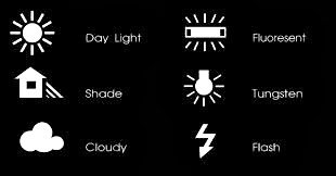
White balance options that are available in most DSLR cameras

Relationship between White Balance and Colour Temperature
Why then do you sometimes get a bluish or yellowish tint to the digital images of your miniatures? It all relates to the lighting environment (or colour temperature if you will) in which the photographs were taken. Learning about colour temperature, which is a characteristic of visible light, can go a long way in getting a basic understanding of why certain White Balance settings are chosen.  

A detailed look at colour temperature
Colour temperature is measured in the Kelvin temperature scale. Cool temperatures are located higher on the Kelvin scale - meaning a light with a higher colour temperature or a larger Kelvin (K) value will have more blue light. Looking at some common lighting situations from cool to warm, Shade comes in at about 7000K, Cloudy is approximately 6000K, Day Light (~5200K), Flourescent Light (~4000K) and Tungsten Light (~3200K). Most Digital Single-Lens Reflex (DSLR) cameras has White Balance settings that you can set for just such conditions. As to what each settings do, read on.

Lighting environment in which my photos were shot
At my workstation is a simple photography setup comprising two lamps, each with a 24W (roughly 125W equivalent) energy saving 6500K cool daylight lights bulbs, which are covered with white diaphanous material to diffuse light, thus reducing glare and harsh shadows. The surrounding area was relatively closed off to outside light with the curtains drawn, although some leakage does occur as the curtains aren't thick enough to completely engulf the room in darkness. This gives you a rough idea of the lighting environment my miniatures were exposed to when their photos were taken. 

Two lamp setup at FourEyedMonster's miniature painting workstation

What does adjusting the White Balance do?
In essence, adjusting a camera's White Balance settings allows you to either add warmth (yellowish tint) or coolness (bluish tint) to the digital photo in order to compensate for the lighting environment. In general, fluorescent lighting adds a bluish cast to digital images while tungsten (incandescent) light bulbs add a yellowish tinge to the photos, if nothing is done with the White Balance to compensate.

For example, if you are taking photos under fluorescent lighting (a cool temperature), you would want to add warmness (yellowish tint) to your digital images by selecting either the 'Shade', 'Cloudy', 'Daylight' or 'Fluorescent' White Balance settings which are ideal for a cool colour temperature range between 7000K and 4000K. In the end, if you have adjusted the White Balance correctly, the colours of your miniature will look close to or be exactly what you see with your naked eye. 

Digital photos of a miniature shown at different White Balance settings

On the above photo montage, I took some photos of the Kingdom Death Pinup Speaker miniature against a black background under different White Balance settings. From left to right, these settings were Auto White Balance (AWB), Shade, Cloudy, Daylight, Fluorescent and Tungsten. I did not use the White Balance settings for Flash Photography as I almost never take photos of my miniatures using the camera flash. Based observations with the naked eye, the setting that displayed the most accurate colours was 'Shade' or the second picture from the left of the above photo montage.

Digital images using the Shade, Cloudy and Daylight White Balance settings

As the lighting environment in which I was working in can be termed as very cool, it stands to reason that I had to select White Balance settings that introduced warmth into my digital images. Based on the series of photos above, warmth was introduced at a decreasing amount from left to right (Shade to Cloudy to Daylight settings). As mentioned earlier, the 'Shade' settings gave me the best colour accuracy for the lighting environment that I was working in. Sometimes, just selecting the 'Auto White Balance' or 'AWB' settings would be good enough but that was not the case here (see below).     

Auto White Balance (AWB) does work on occasion but not this time

As an example how bad your digital images would look like at the wrong White Balance settings, I also took some photos at two extreme settings in my case study (see below). Firstly, while the 'Fluorescent' setting was supposed to introduce warmth to photos, it however, no longer did so under the cooler lighting environment I was working in. Secondly, the 'Tungsten' setting which is supposed to add coolness (or bluish tint) to images taken in warm environment just made things worse.

Fluorescent (left) and Tungsten (right) White Balance settings

So what happens when the custom White Balance settings do not work. Well, for starters you can try manipulating the lighting environment you work in e.g. move the lamps to a different distance from your miniatures etc. You can also either resort to setting a custom White Balance setting or use other advanced hardware functions that modern DSLRs have nowadays. If all else fails, the most efficient method would be to correct the White Balance of digital images using computer software, which I do resort to on occasion if it gives me the colour accuracy that I am looking for.


Now I do not profess a mastery of White Balance adjustments in digital photography as I still struggle to get good colour accuracy especially when using white backgrounds. What I hoped to achieve with this blog post was to share with you my experiences when dealing with White Balance issues and perhaps give you a basic understanding of what White Balance is all about and take the mystery out of that bluish (or yellowish) tinted digital photo of your miniature. Thanks for reading and please do share in the comments below if you have your own solutions to White Balance issues.

Saturday 12 October 2013

Knight Models Zombie Girl [Completed]

Two songs kept running through my head as I put the finishing touches to the Knight Models Zombie Girl, one was sad and melancholy while the other was upbeat and catchy. The former tune would have been perfect if one imagines it playing in the background from a radio as the Zombie Girl shambled along the road; the song ... 'End of the World' by Skeeter Davis. Meanwhile, the latter tune is one that I always associate with zombies close to Halloween that is 'Thriller' by Michael Jackson.

Knight Models Zombie Girl completed

I finally ended up painting the Zombie Girl's dress in pastel orange with white laces and a light lavender bow. The dress colours was as light and muted as I was willing to go to maintain a fine balance between providing enough contrast to further accentuate the skin tone but not too much as to overwhelm it and shift focus of the eyes mainly to the dress instead of the figure's pallid appearance. Well that was my intention anyway and how successful I was in this is open to debate.

Don't they know, it's the end of the world ... it ended when mum ate my brains ...

Dress colours for the Zombie Girl were partly inspired by the traditional colours of Halloween as well as a personal desire to do something different from what usually comes to mind. In comments on an earlier post, my fellow local painters had sportingly given some good suggestions which included blue, pink, green and yellow - some of which I very nearly ended up using. But in the end, I decided to go for colours most would not expect but yet ... hopefully ... makes sense when you think about it.  

Knight Models Zombie Girl (side view, left)

Hands down this is the most beautifully sculpted zombie miniature I have seen so far and it was really fun figuring out how to paint both the base and the Zombie Girl herself. Knight Models should seriously consider expanding their Terror Series line of miniatures and add more zombies while they are at it. For me, this miniature was love at first sight bite ... (ouch).

Lighter orange pastel colours on the dress versus the darker hue on the pumpkin

If there is one thing I would consider improving on is perhaps the eyes by adding pupils. But the danger in doing that for someone of my relatively lower skill level is that I might end up making the eyes look comical and artificial instead of creepy. Regardless, I always felt more scared by the clouded-white-irises-on-a-bloody-sclera look that you occasionally see on horror movies. 

I didn't go overboard with the blood as I wanted her to look like a 'normal' girl from the back

Another thing that could have added more contrast to the figure would have been to paint the Zombie Girl's hair black or make her a brunette. Nonetheless, I am still happy with her being a blonde.  

From this viewpoint, you can see the Zombie Girl arching her back at an unnatural angle

As you can see, I did not paint much blood stains on the Zombie Girl's dress. Rightly or wrongly, I did this intentionally to keep as much of the 'normal little girl' look on the undead figure as possible. I felt that by doing so it would make the abomination of what has happened to this innocent little child all that more horrifying and also smooth out the disconnect between reality and fantasy/horror.

Knight Models Zombie Girl (side view, right)

Finishing the Knight Models Zombie Girl just before the start of the latest season of 'The Walking Dead' TV series as well as before Halloween was fortuitous timing-wise. It allowed me to complete my first TV viewing event / holiday themed miniature. Sweet!    

It's close to midnight, something evil's lurking in the dark ...

It was a blast trying to paint in details in the painting of the base. If you have missed an earlier blog post on the base then click here to see the many small little details I had tried to incorporate. 

Can you spot the Reese Peanut Butter and Nestle Crush candy bars?

Well that's it for now. Till my next post stay clear of the walking dead unless they ask for candy.


Thursday 10 October 2013

Knight Models Zombie Girl [WIP - All but the dress]

Yet more progress has been made with the Knight Models Zombie Girl with work done on her hair, teddy bear, socks and shoes. While reasonably satisfied with how her eyes turned out, I might still make some changes depending on how they look when her dress has been painted. One thing I am contemplating is to paint a light greyish pupil on the cloudy white irises. But I am a bit hesitant to do so because it might dial down the creepiness factor of her eyes. Moreover, a quick test run using the Windows Paint program was not too encouraging in that a greyish pupil made the eyes look comical.

Knight Models Zombie Girl - work-in-progress on her face, hair and eyes

As alluded to in the previous post, the Zombie Girl's hair has been painted blonde. I felt it to be more in sync with pale and fair skin tone that I was going for. Hopefully, the blonde hair will also combine well with the pastel coloured dress that I have planned for her. 

Blonde zombies have more fun and eat more brains

My version of the Knight Models Zombie Girl is based on a zombie child seen early on in Season One of The Walking Dead. The main difference is in the eyes whereby my version lacks pupils.

I want my mommy ... her brains that is

Her teddy bear was painted in the traditional colour of brown. I tried my best to create a furry soft toy look and in line with the horror theme I added a rivulet of blood running down teddy's front. As for the teddy bear's back, I painted stained blood as if the girl had been hugging it close to her face.

Teddy bear in the Zombie Girl's grip
Back view of the blood stained teddy bear

Unfortunately I messed up her socks by not clearly painting out the fabric lines you usually see in white wool socks. I only managed a hint of this which is just not good enough. I will have to touch up the socks and hopefully add some depth to the white socks. Anyway, below are some work-in-progress picture of the Knight Models Zombie Girl so far.

Knight Models Zombie Girl - All but the dress
Work-in-progress Zombie Girl - angled side view (right)
Work-in-progress Zombie Girl - angled side view (left)
Back view of the work-in-progress Zombie Girl

Coincidentally, the Walking Dead series resumes this weekend in the US and a week later here where I am at, and I am really looking forward to Season Four. Next up will be photos of the completed Knight Models Zombie Girl so please stay tuned for the early Halloween treat.    


Tuesday 8 October 2013

Knight Models Zombie Girl [WIP - Skin]

Using a combination of light purple, pale green, reddish brown and a myriad of fair skin colours, I went about painting the skin of the Knight Models Zombie Girl to try and recreate one of the zombie children shown in the Walking Dead series. Since I didn't have any recipe to work from, I painted the skin largely based on trial and error. Additional touch up work on the Zombie Girl's skin tone is dependent on how her skin plays off the final dress colours, which will be a mix of pastels.    

Knight Models Zombie Girl - initial work on the skin and eyes

As the Zombie Girl is based on the skin tone of a young white Caucasian girl, the shadings and highlights on the skin are subtle without too much emphasis on contrast. One example is the Zombie Girl's collar bone which had very subtle highlights to differentiate it from the rest of her neck.

Exposed bone can also be seen on the Zombie Girl's open wounds

Currently, the Zombie Girl's skin tone looks paler than it actually is because of the greyish unpainted dress. I am hoping her skin tone will take on more depth and contrast when seen next to a fully painted dress. If it doesn't, then I might add more shadows to her skin tone.

What a heart stopping smile
As for her hair, well blonde zombies always have more fun. Moreover, it will better suit the pale skin that I have painted on her so far as well as accentuate the gory wounds on her face and head.

Back view of the Zombie Girl's skin tone

Thanks for checking out my work-in-progress on the Knight Models Zombie Girl. For now, she is on track to be finished by Halloween. My major obstacle is deciding what colour her dress is going to be. So far, I am only sure it is going to be pastel colours but nothing more specific.


Related Posts Plugin for WordPress, Blogger...