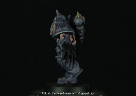
Of the four chosen chaos space marines dedicated to
Nurgle,
Slaanesh,
Khorne and
Tzeentch, it is Slaneesh's favoured one which fascinates me most, colour-wise that is. That's because Slaanesh subjects have base colours that can be mixed into a light pastel-like scheme. And as I've mentioned before - probably
ad nauseam - light pastel colour schemes are firm favourites of mine.
 |
| Slaanesh Chaos Chosen sports a demonic face playing peekaboo from his shoulder armour |
 |
| Sickly flesh permeates the Slaanesh Chaos Chosen's armour |
At this stage of the painting process it's still too early to gauge the overall look I'm going for. Suffice to say I want to infuse it with hues which, to paraphrase the words of the Executive Director of the Pantone Color Institute,
reflect a soothing sense of peace and order. Wait a minute! Slaanesh. Peace and order. Sheer humbug? I'll leave it to you to be the judge when I finish painting the last major hue of my Slaanesh colour scheme. But just so you know, I'm going for a creepy
My Little Pony look.
 |
| Slaanesh chosen, work-in-progress on his armour, cloth and demonic flesh |
 |
| Demonic face pops out of the chosen's shoulder pads like an unwanted boil |
 |
| Slaanesh chosen's claws will take on the last major hue in order to complete the colour scheme |
For the Slaanesh chosen's organic forms, I wanted to convey ulcerating and necrotising flesh rather than dead or rotting flesh. In other words, molecules in demonic flesh that is trying to regenerate while in its death throes. So that meant flesh with more pinkish/purplish versus greenish hues.
 |
| Chosen's violet armour is more or less done with only extreme highlights yet to be painted on bony protrusions |
 |
| Demonic flesh is prevalent on the chosen's back, more so than in any other part of his body armour |
 |
| Whereas Nurgle's chosen had rusted metallic parts, Slaanesh's chosen is largerly expected to have shinier metals |
Meanwhile, plans are for the base to be kept simple and dull. This is in anticipation of an overall light pastel colour scheme. Anything bright and vivid will likely distract from the miniature itself. To fulfill these conditions, only neutral greyscale colours fit the bill. Sometimes boring is what's needed.
 |
| From this angle, no blues are visible thus showing more traditional Slaanesh hues but too dull in my opinion |
 |
| Blues of the loin cloth was tempered by a purple wash to ensure a more Slaanesh-like colour scheme |
When the claws are finished next, the Slaanesh chosen's colour scheme will then take on a more definite identity. One that will no doubt be confusingly pleasant and disgusting at the same time. Only time, or my next post, will tell if I can pull this off. In the meantime, the weekend is almost here so have a good one until my next update of this project comes along.


Oh my goodness, that is looking wonderful already.
ReplyDeleteThank you Michael. :)
DeleteVery cool looking mini and off to a good start.
ReplyDeleteIt is a lovely sculpt and a good start I will take any day of the week. :)
DeleteI like where you are going with that palette!!!!!
ReplyDeleteFunnily enough, I just saw this palette in the merchandising aisles of a shop called Smiggle. Love the colours myself but not sure if this is its intended atmospheric feel. :)
DeleteMost impressive figure!
ReplyDeleteYes it is :) Games Workshop have some really good stuff, it's just a shame the W40K stuff has gotten so expensive due to a combination of rising prices and falling local currencies.
Deletereally nice!! :)
ReplyDeleteThank you :)
DeleteOoh, very good. Very good indeed. :)
ReplyDeleteThank you very much pulpcitizen :)
DeleteThings are proceeding nicely, sir.
ReplyDeleteThank you kind sir :)
DeleteHohoho, this is tremendously great! I like your approach and the reasoning behind.
ReplyDeleteHe'll be the cutest Chaos Chosen in W40K history ... XD :)
Delete