Pages

Sunday 31 January 2016

Nurgle Chaos Chosen [WIP - Calcified protrusions]

When I think of Nurgle, one of the things that come to mind are numerous calcified protrusions be it horns, deformed bone or just pointy skeletal thingies in general. That and plenty of diseased, rotting, and necrotising flesh. Not really a pretty picture to look at let alone paint but there you have it. 

Nurgle Chosen, work-in-progress on the calcified protrusions (horns, bones and pointy skeletal stuff)

If you look close enough, you may have noticed that not all calcified protrusions were painted the same way. To be specific, I went about painting these three types of calcified materials in three different ways. You might wonder why use such a time consuming approach? Well, simply because painting all of them in the same way would have resulted in an excruciatingly boring colour scheme. 

Exposed lungs peep out from in between the Nurgle Chosen's rib cage
Addition of the beige/yellow/brown layers has somewhat brightened the green armour
Still undecided whether to go for a rotting flesh look or bony look for the stripes on the boltgun

For the bones, I used the old Citadel Khemri Brown, Bleached Bone and Skull White in various ratios; each applied as a thin layer from darkest to brightest always with part of the bottom layer showing through and all tied up with a Devlan Mud wash. For the horns, I started with Scorched Brown followed by a drybrush of Khemri Brown and Bleached Bone plus a Devlan Mud wash to give it a different, darker texture. Finally for the pointy skeletal stuff, I reversed the order of brightness from light to dark i.e. I began with Bleached Bone followed by Tausept Ochre, Calthan Brown, Scorched Brown and then Chaos Black to simulate a burnt tip look. All in all, three slightly different looks.

Horns atop the Chosen's helmet extend partly to the heavy bolter on his back
Nurgle Chosen, back view of the latest work-in-progress
Spinal cord at the Chosen's back had the same colour scheme as the ribcage

Next up will be the Chosen's fleshy bits as well as loincloth which may yet change the existing look and further tweak the existing colour scheme. I feel that the Chosen needs an injection of some semi-bright pastel colours to make it 'pop'. What I have in mind and what I may be able to execute are two different things entirely so I hope to find a middle ground and make a half decent attempt. 

Not much calcified protrusions from this angle apart from some pointy things on the right leg

Currently, I'm alternating between working on Bandai's Star Wars model kits and my usual minis. While assembling a 1/12 scale Stormtrooper (something I'm able to quickly work on as I try to source paint supplies for the Millennium Falcon) I somehow stabbed myself pretty hard with a blade. The wound below looks innocuous enough but it was deep enough to cause a fair amount of bleeding. As tempting as it was to use actual blood on my Nurgle Chosen I wasn't that gross. Not really. 

An innocuous looking wound that was rather deep

Other than being a klutz around sharp implements, I'm making good progress on both fronts. It's great to have variety in your projects as it keeps things from getting stale. On that note, here's wishing you an interesting week ahead hobby-wise. And be careful when using sharp pointy tools.

http://shireworks.blogspot.com/https://www.facebook.com/shire.works

Wednesday 27 January 2016

Many Bothans died to bring me this information

Okay so none did ... maybe a few tauntauns? ... no? I guess it just felt more epic that way. Coming up with a strategy to paint the Bandai 1/144 scale Millennium Falcon, unfortunately, involved the more mundane method of online research of blogs and forums to see how it has been done before.  
A Bothan conducting a mission briefing; source: wookieepedia

Being fairly new to the vehicle painting scene, I'm pretty sure the methods laid down below aren't as fool proof as I wish them to be. As I'm more used to painting using water-based acrylics only, I will have to be careful when incorporating enamel paints such as the Tamiya Panel Line Accent Colours as well as lacquer paints basecoat like the Tamiya AS-20 Insignia White into the mix. Also the possibility of using gloss clear coats to facilitate decal placement as well as panel lining before applying a matt coat to remove the shine - all adds to the complexity for a vehicle-noob like me.      
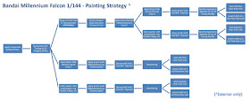
Painting strategy for the Bandai 1/144 Millennium Falcon model kit

As part of my 'research' to find an accurate colour scheme for the Millennium Falcon, I played numerous matches in the Star Wars Battlefront Fighter Squadron Mode until I finally got the power up to play the most famous Corellian YT-1300 light freighter in the galaxy. I had a blast using the ship. More importantly, I recorded useful digital references from my multiplayer session (see video below). Dice, the game's publisher, has recreated cool movie-accurate versions of the various vehicles from the original trilogy. Nonetheless, the Falcon's colour scheme is still usable as the only thing that has changed in the Force Awakens is the radar dish ... and perhaps a tad more sand weathering.    


One thing is for sure, regardless of the colour scheme I'll have to test out some of the above painting strategies on old unwanted parts first rather than directly on the Falcon. That way, if things turn out badly you won't see a grown man cry pitifully over his spoilt plastic toy. Thankfully, lady luck was with me as I found the perfect piece to be the guinea pig - an old Chaos Rhino Transport part. It has sufficient details which in part mimic those found on the Falcon's hull. It'll allow me to test out the non-acrylic paints as well as weathering pigments I haven't used before.   

A Chaos Rhino part (front/back view) that will serve as the practice piece for at least two of the above strategies

Gathering the required materials for my paint-test-session for the hull is turning out to be a slower than expected process mainly because the supplies have become super pricey due to the falling ringgit and the fact that some key ingredients I need are out of stock. So even as I slowly acquire the stuff I need to begin test painting the Chaos Rhino, I prepped parts that fell under more familiar ground namely the figures and cockpit interior. All these will be painted using acrylics so I already have what I need to get started on Han Solo, Chewie, Finn, Rey, BB-8 and the cockpit interior.

Figures and cockpit interior are pieces which lie in my 'painting comfort zone'
Parts were cleaned using Isopropyl Alcohol before being primed with my favourite primer

Parts pertaining to the said figures and cockpit interior were cut off from the sprue, cleaned with isopropyl alcohol (it's worth noting that some expert modellers don't bother to clean their kits prior to priming), and then primed with the light grey Tamiya Fine Surface Primer. In a departure from my usual practice, I will be painting most of the parts still attached to the sprue/runner/gate. Why? Because the parts involved are too tiny to be effectively held in any other way.

Locations where joints occur were blocked off with Blutack before priming
For the figures, as much of the runners/gates were trimmed off before being primed
Some parts were primed as is on the sprue (left) while others will be primed after assembly (right)

It amazes me how Bandai still managed (and is willing) to cram so much detail into the figures and cockpit interior seeing that the focus is primarily on the Falcon's exterior hull. To show you what I mean, I chose the smallest figure in the model kit: a 1/144 scale BB-8 Astromech Droid (see below).

Even at such a small scale, the BB-8 Astromech Droid still holds some fine details

Seeing that the Millennium Falcon is going to be a long-haul-project, I plan to get a quick fix for my Bandai Star Wars model kit addiction by attempting something that requires less paint and less work to assemble. I will likely finish a 1/12 scale model kit of the Stormtrooper long before I finish painting the Falcon so I plan to do a review of this kit - the whole shebang - from unboxing to assembly to decaling and painting in a few weeks time. So stay tuned for this in a future post.  

Service guarantees citizenship, would you like to know more ... Oops ... wrong trooper quote

Although I'm in full-blown Star Wars mode, I still have enough left in the tank to remain enthusiastic about other projects such as the Chaos Nurgle Chosen. By the next post, I should have completed yet another major portion of the mini so stay tuned for that as well. Until then, be well and happy!

Friday 22 January 2016

Nurgle Chaos Chosen [WIP - Armour]

In a nod to the four gods of Chaos, I will be undertaking a project - amid many others - to paint four (one for each god) Chaos Space Marines with above average details. These I found in the form of Chaos Chosen Space Marines from the Dark Vengeance starter set. And of all six miniatures found in the set, the one below seems most suited as a visual tribute to the Chaos God of Disease, Decay and Destruction; the Lord of Pestilence; or otherwise affectionately known as Papa Nurgle. 

Nurgle Chaos Chosen, work-in-progress (WIP) on the armour
Olive green and yellowish ochre colours dominate ...
... complemented by a complex wash comprising six different hues

For my Nurgle Chosen, I went with the long established yellowish green hues that have always been associated with the warriors of the Plague Lord. As for the washes, I referenced a paint recipe used by the Games Workshop's dedicated painting studio ('Eavy Metal). It called for various combinations of old Citadel Leviathan Purple, Devlan Mud, Ogryn Flesh, Baal Red, Gryphonne Sepia washes as well as Golden Yellow and Scab Red acrylic paints. But because I wasn't too sure as to the way these washes/paints were applied to the model, I instead used my gut feeling in many instances.

Right pauldron awaits a suitable freehand painting to signify the Chosen's dedication to Nurgle  
Metal bits were painted to block off the underlying areas and in the early stages i.e. before weathering
Back view of the Nurgle Chaos Chosen, WIP

You'll have to trust me on this but I expect the colours of the Chosen's armour to get better (or the technical term 'pop') as the other hues are layered onto the model, for example the bones and horns. This is a lesson I've had to learn the hard way. When I first started painting I tended to make frequent colour modifications to a particular part of a miniature without realising that its look will eventually change as other hues are layered on. Nowadays I trust my instincts more and even if the colours turn out wrong it's always, always better to make changes to the colours then and not before.

Still deciding between a fully metallic bolter with rust vs worn down one with orange panels
Washes applied around bony protrusions on the left pauldron will become clearer when hues come into play
Next up for Nurgle's Chosen are the bones, horns and other calcified protrusions

Painting miniatures in between sating my new found addiction for Bandai's Star Wars model kits is turning out to be a fantastic 2016 so far. It has been months since I've felt this invigorated by the hobby. I'm also learning so much stuff from the vehicle painting side of things. For someone more attuned to painting figures than vehicles, it finally took a modified Corellian YT-1300 light freighter to push me to try my hand at vehicles too. At the very least, it's going to be an interesting year ahead.

http://shireworks.blogspot.com/https://www.facebook.com/shire.works

Monday 18 January 2016

Using the Google Translate App on Bandai's Japanese manual ... Not quite a Universal Translator but it'll do

Back in the day when video conferencing and hand-held communicators were a pipe dream, I never imagined some of the fanciful concepts and thingamajigs of this popular 1960s Sci-Fi series would eventually become a reality. First seen in Star Trek: The Original Series Season 2 Episode No.9, the universal translator (held by Captain Kirk, see photo below) was one of the many gadgets that wowed and intrigued me. Cue the Google Translate App ... not quite a Universal Translator but it'll do.

"Spock, I think Bandai wants us to attach part A to part D ..."

For a tech savvy painter/modeller who is strangely averse to the app revolution, the Google Translate Android App has been a surprising find; more so since I was a regular user of the browser version. Available to Android Smartphone users since 2010, the app is currently in its fourth iteration and it's only now that I had decided to take the plunge and install the app and its Japanese language pack. 

Using the Google Translate App to decipher the Bandai model kit instructions

Being fairly straightforward and intuitive to use, I had the app working for me in no time. It's a  simple process of using your smartphone to take a photo, then swiping to highlight the relevant text, and finally getting the translation on screen (see Steps 1 to 3 below).   

First language package I downloaded was ... surprise, surprise ... Japanese
Step One: Take a picture of the text you want translated
Step Two: Swipe your finger to highlight the text you want translated
Step Three: Text translated

Now, I don't know much Japanese beyond the very basics and even then it's more in the realms of spoken rather than the writing system of kanji, hiragana and katakana. Hence I'm putting a certain amount of blind faith and trust in the Google Translate app's translating ability. Based on a cursory glance, the app seems to be getting the basic phrases/words right. On the other hand, for more complicated sentences the translated text at times look like bad English with some nonsensical words strewn about resulting from the app's inability to understand the nuances of the Japanese language. But unless you have a personal live-in ex machina translator, this app is the best you've got.

More translations of simple Japanese text
Trivia on the Universal Translator; source: fsd.trekships.org/operations/comms-ut.html

For you casual Star Trek fans out there, you might be interested in this interesting little piece of trivia on the Universal Translator as seen above. Heck, in the future they might even have one with a PG-13 setting in which swear words are turned into beeps or, and this would be amazing, translate finger gestures into actual words. No more confusion arising from the middle finger gesture then. 


Just looking at the Bandai Star Wars model kits released (and those in its release schedule), I can tell you I'm already at the Shut Up and Take My Money stage. With my problem being a severely limited budget, I have to be careful where I source the model kits as in Malaysia prices range drastically from good value to ridiculously overpriced. For example, prices of the Bandai 1/48 scale Imperial AT-ST walker range from as low as RM82 to more than double at RM167.90. My advice is be patient and do your research before buying. Alternatively you can stay tuned to my blog for a future post on getting your Bandai Star Wars fix without going flat broke. You're still gonna have to tighten your belt but at least you'll have that shiny plastic kit in your hands. Search your feelings, you know it to be true ...  

Tuesday 12 January 2016

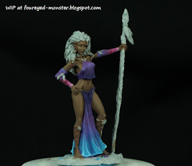
Wood Elf Goddess v.2 [WIP - Dress]

What better way to kick start a new hobby year by doing one of the things I love most i.e. painting smooth transitions between different hues be it through wet blending or layering techniques. Either is a skill I have yet to master but I'm sure having a lot of fun practicing both techniques.

Wood Elf Goddess, work-in-progress on a second version of this beautiful Dark Sword miniature
Version 2 spots a darker skin tone and cooler hues for her dress
Highlights at the front lower fringes of her dress is pure sky blue

To recap, the first version that I painted had a warmer colour scheme (see below). My aim, for the second version, is to give the Wood Elf Goddess a completely different look. So much so that if you were to look at her you would have to do a double take as to whether it's the same miniature.  

Dark Sword Miniatures - Wood Elf Goddess v.1

Doing another version of the same miniature doesn't feel boring at all largely because this a lovely sculpture to work with, one of my all time favourites so far. For me to want to work on a miniature I have to be inspired by it. Inspiration takes many forms. Mostly, they either arise from interesting lore/background story (W40K, Star Wars, Star Trek, Walking Dead, etc) or they can just simply be a beautifully sculpted piece as in the case for the Wood Elf Goddess I'm painting now.  

Highlights occupy a larger surface area on the rear of the Wood Elf Goddess's dress
Back view of the Wood Elf Goddess, work-in-progress on her dress
Hue of the Wood Elf Goddess's hair will be critical in making this colour scheme work

Colours for the Wood Elf Goddess's dress comprised solely Vallejo Model Color (VMC) acrylic paints such as Violet (047), Purple (044), Blue Violet (046), Sunset Red (041), Pink (040), Old Rose (039), Light Turquoise (068), Deep Sky Blue (066) and Sky Blue (067). And as mentioned earlier, the transitions between hues was achieved using both wet blending and layering painting techniques.

Vallejo Model Colors use to create the sky blue to turquoise to purple to pink transitions

Well, 2016 is off to a bright start. Amidst researching the tools, paints and colour schemes for my Star Wars Millennium Falcon project - 'research' as in looking at cool photos and videos of movie set/modeller model kits as well as playing the Star Wars Battlefront video game ... more on this in my upcoming posts - I'm also working on miniatures like this Wood Elf in my initial project pipeline. Bandai's superb Star Wars model kits have gotten me excited about delving into the realm of vehicle painting. And it has also gotten me out of a mini burnout occurring in the last month of last year. Two for the price of one if you will. Akin to shooting two rebel scum with one blaster shot. Sweet!


http://shireworks.blogspot.com/https://www.facebook.com/shire.works