What better way to celebrate the return of sunny blue skies after a haze-free week then to complete perhaps the most cheerful pair of figurines in my collection. And who else better exemplifies such a happy and optimistic outlook than both
SpongeBob SquarePants and
Patrick Star. Back in the day, when my son was a preschooler and I had less whites in my hair, our first SpongeBob episode together was one that revolved around bad breath. It was disgusting enough to make me wonder what SpongeBob's appeal to kids was. But in the end I got it. Now I wish more people have SpongeBob's innocent goodness in his heart than the
Squidward Tentacles we have all become.
 |
| Patrick Star (left) and SpongeBob SquarePants (right) |
Shading for this mini-diorama looks deceptively simple but it actually took a lot of layering as well as wet-on-wet blending to achieve the smooth transitions you see, especially on Patrick. Less shading work was done on SpongeBob, partly to balance out the fact that he had more details than Patrick.
 |
| Nickelodeon Best Friends mini-diorama featuring SpongeBob SquarePants and Patrick Star |
 |
| Having more details meant SpongeBob warranted less shadows/highlights transition work compared to Patrick |
 |
| Side view (left) highlighting SpongeBob's nose |
 |
| Olive green shadows on SpongeBob could easily have been shaded olive brown instead |
One thing that could have been done differently was the olive green shadows on SpongeBob. An alternate choice would be to use olive brown instead. However, I chose the former to brighten up SpongeBob's colour scheme and hence the overall look of the piece. Meanwhile, my son cheekily suggested that Patrick's belly button should contain more shading (if memory serves me right, there was an episode showing Patrick's fascination with the contents of his belly button .... ewww ?) to reflect the contents of Patrick's innie. I passed on that! There is a case for too much realism.
 |
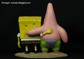
| Back view of the Nickelodeon Best Friends mini-diorama featuring SpongeBob and Patrick |
 |
| Hands on back shoulders, the classic best friends pose |
 |
| Side view (right) highlighting Patrick's tummy |
 |
| Patrick had more shadows/highlights transition work done on him to compensate for lesser details |
Living in a pineapple under the sea means the base has to be a sandy beach. It's a no-brainer. To accurately simulate such a texture, I used a combination of three old Citadel acrylic paints i.e. Bestial Brown, Bubonic Brown and Bleached Bone. Dry-brushing the latter two hues on top of the the initial basecoat colour created a sense of depth on the already nicely sculpted beach. But one challenge the base threw up was the difficulty in getting paints to penetrate the tiny ubiquitous pockmarks. To solve this problem, I mixed Citadel Lahmian Medium into the basecoat colour of Bestial Brown to reduce surface tension of the paints. This then allowed the basecoat paint to penetrate the pockmarks.
 |
| Base comprises three layers of dry-brushed paint to simulate depth in a sandy beach |
It has been a slow couple of weeks hobby-wise. I must be suffering some form of burnout as my productivity seems to have nosedived drastically. Even my plan to draw at least one portrait a month has been effectively curtailed. Try as I might, I can't quite put my finger on what's ailing me. If I don't get a handle on this soon, I might just find my painting or drawing activities come to a complete standstill. And that can't be a good thing if the law of inertia is anything to go by.


.jpg)
Absolutely great!
ReplyDeleteThank you Luca.
DeleteThey look splendid, considering the colours involved on such surfaces it's absolutely brilliant. I think you made the right choice with olive instead of brown for the shades on Bob. Never thought about using medium to break the surface tension before (only to desaturate the paints) but I'll keep that in mind for those kind of textures.
ReplyDeleteThanks man. I could be wrong about the Lahmian medium but I noticed that the painters at GW used them to dilute the paint to wash consistency. To function as a wash the paint has to penetrate every nook and cranny so I just figured that the breaking of surface tension was at work.
DeleteCool, really cool! THey look superb!
ReplyDeleteMerci Phil. I hope you and your family are safe from the horrible terrorist attacks on Paris. :(
DeleteLooks fantastic ! Masterpiece !
ReplyDeleteI'm looking forward to your next project.
Greetings
Thank you very much Mario.
DeleteWow, that piece is really tricky, the use of such colours on those large surfaces requires quite a prowess and steady hand. Transitions are sweet and the whole set looks gorgeous. Pretty nice work! Hope you get better!
ReplyDeleteMany thanks Suber. I really appreciate your kind words of support.
DeleteWow! That is so impressive, totally seamless painting!
ReplyDeleteThank you sir. Thank you.
DeleteSquidward would be spinning in his grave - you know, if he were dead. Love them :)
ReplyDeleteHa ha ... yes he would. Poor squid is never the centre of attention. :)
DeleteAwesome job dude! Incredible blending. I love them!
ReplyDeleteThank you Bob. Very much appreciated.
DeleteHigh art, indeed - very nice!
ReplyDeleteVery humbling words Colgar. Thank you.
DeleteThis is incredible! I really cant tell if the shadowline around patricks shorts is a real shadow or superbly blended.
ReplyDeleteThanks Aerouge. The bottom of Patrick's shorts are indeed painted a darker shade of green but the shadows seen above are partly contributed by lighting.
DeleteThe part between his legs is actual another colour? I assumed so, but this is actually awe inspiring great ... you continue to inspire me! Hopefully you manage to get your productivity up again :-)
DeleteBrilliant work, with super smooth colours. :)
ReplyDeleteThat is a great looking piece. Maximum kudos. :)
Many thanks puplcitizen. :)
DeleteLove it. The blending on Patrick is superb.
ReplyDeleteThanks Finch. Appreciate it. Admittedly, the blending on Spongebob is not as extensive as I was pretty preoccupied by the yellow one's more numerous details.
DeleteSplendid! Definitely better than the original ;-)
ReplyDeleteYou are very kind Moiterei. Thank you. :)
Delete