Pages

Wednesday 25 March 2015

Knight Models The Hulk [Completed]

With two main parts of the Knight Models The Hulk 1/28th scale miniature already completed earlier - namely his skin tone and denim jeans - finishing this green superhero's overall paint job was pretty easy. The base was done up with dry brushing and washes while The Hulk's face required more detailed brush work, especially to help define the pupils as well as each individual tooth (of which the lower row was better defined than the upper one due to my own missteps but I was too darn lazy to rectify seeing that they were not truly visible to the naked eye - only a macro lens can show this up).  

Closeup of the Knight Models The Hulk 1/28th scale miniature

Working on this Knight Model figure primarily allowed me to improve my skin tone wet blending and layering skills as well as try to perfect my take on painted denim texture. As The Hulk was practically all skin and pants, I could fully concentrate on both techniques without worrying too much about keeping neat lines amongst many small details as is the case for most of my other miniatures.  

Knight Models The Hulk [Completed]
Nicely sculpted musculature made it easier to define shadows and highlights on The Hulk's skin
An exposed rusty pipes added some variety to an otherwise humdrum base

All in all I found Hulk an easy miniature to paint with the main challenges arising from trying to get smooth transitions on his skin tone and a realistic denim texture on his jeans. Easy to paint but doing it well is another matter entirely, something I do not lay claim to in my finished piece you see here.  

Base comprises three different layers of asphalt which didn't show up clearly in the photo  
Back view of the Knight Models The Hulk [Completed]
Hulk's pants were painted to resemble denim texture

Hulk's base was dry brushed with varying shades of grey before brown hues were added to show the different layers present in a cracked asphalt road. An exposed pipe below Hulk's right leg was painted to resemble a rusted bronze pipe. Finally some black and brown washes were applied to tie the whole thing together. All of it was pretty humdrum stuff as bases is my Achilles heel in miniature painting. 

The Hulk didn't require a lot of head scratching to determine its colour scheme


360 view of Knight Models The Hulk
To view The Hulk in 360 degrees, please check out the YouTube video below. For videos of other selected miniatures I have painted, please visit my YouTube channel FourEyedMonster Miniatures. Please remember to choose high definition (HD) for the best video viewing option.


Thus far, all the figures in my Marvel Universe miniature painting project have been superheroes namely Iron Man, Logan, Spider-Man and The Hulk. I suppose it's about time I started work on a supervillain instead. To kick off the darker half of this project, I plan to prep Loki (infamous step brother of Thor) as soon as I finish painting some other miniatures that are in their final stages.


Meanwhile, in keeping with my continuing reading binge I picked up a more serious novel this time by Haruki Murakami titled Sputnik Sweetheart, a dark novel with loneliness as its main theme. While not everyone's cup of tea, Murakami's works are enjoyable for the characters that he brings to life via words. Thus far, this being his second book I have read after Norwegian Wood, I have found myself eagerly turning the pages of his work, driven by curiosity as to what is going to happen next to his characters. Only negative to all this reading is less time for my miniatures. Oh well ... c'est la vie!

Wednesday 18 March 2015

House Martell warhorse [WIP - caparison sans heraldry]

After a long hiatus from my Game of Thrones knight paint job conversion project, I have finally found the momentum to overcome the inertia that comes with a project that has been shelved for some time. It helped that this latest piece afforded me the chance to play around with wet blending and layering of acrylic paints in the 'orange hue range', something I had been meaning to do on large surfaces for quite a while now. I certainly had fun mixing up and splashing on the orange paints.

House Martell warhorse, work-in-progress
Warhorse awaits the freehand heraldry of House Martel
Front and back views of the work-in-progress House Martell warhorse

As with the other knights in this personal Game of Thrones project, the warhorse's caparison awaits the freehand painting of it's noble house's heraldry. In this case, it's a spear through a sun for House Martell. As I am currently viewing freehand clothing pattern painting tutorials, every cloth that doesn't have repetitive freehand patterns look 'naked' to me now. However, I have no plans to paint such designs on the caparison. If I did it on this warhorse I would have to go back to all the others I have finished and paint repetitive freehand designs on them. Too much work to be even considered! 

Orange hues on the caparison were painted using Vallejo Model Color acrylic paints
Green grass near the warhorse's hooves provide vivid contrast to the orange hues

Paints used to achieve the orange hues on the warhorse comprised solely of Vallejo Model Color stuff, specifically Scarlet, Orange Red, Light Orange and Deep Yellow. A more vivid contrast was achieved by painting the grass near the warhorse's hooves a bright green while the yellow reins provided a more 'harmonious blend' to the orange colour scheme. Both the greens and yellows were painted using Citadel acrylic paints as were the leather straps ans silver bits on the warhorse.

Warhorse is still missing its yet-to-be painted knight in shining armour
Blending and layering of paints to try and achieve smooth shadow-to-highlight transitions

Ironically, my head was filled with orange and yellow hues courtesy of the latest book - Fahrenheit 491 by Ray Bradbury - I had finished, not unlike having one's thoughts being run through an orange/yellow filter. This classic dystopian novel depicts a world in which possession of books is illegal and the story primarily revolves around a 'fireman' which burns books. It's a relatively short read and one worth delving into. Finishing two short books in quick succession (the other being Lisa Genova's Still Alice) has kinda freshened up my mind and I now feel mentally invigorated enough to pick up where I left off in Book Four of the A Song of Ice and Fire series by George RR Martin. A touch fitting perhaps as my work on the House Martell knight and warhorse gathers pace.

http://shireworks.blogspot.com/https://www.facebook.com/shire.works

Wednesday 11 March 2015

Nickelodeon Best Friends Diorama [WIP - Patrick Star]

Painting Patrick Star, the other half of the famous SpongeBob SquarePants duo was one of those rare times when everything that could go right did. For one, I managed to get a good approximation of Patrick's official colour scheme without having to resort to too much paint mixing. In addition, paint layers were quite smooth especially Patrick's skin tone while my attempt at painting freehand patterns on his pants went off without a hitch. I guess it's about time a bit of good luck went my way. 

Patrick Star, work-in-progress of the Nickelodeon Best Friends Diorama
To obtain a smooth layer of paint on such a large surface area using just a brush, a fairly small one at that i.e. a size zero, I used mainly Vallejo Model Color (VMC) paints for Patrick. Acrylic paints used were VMC Pink, Old Rose, Salmon Rose and a smattering of Rose Brown (for the skin tone); VMC German Camouflage Bright Green, Lime Green and Yellow Green (for the pants); VMC Purple, Violet and Blue Violet (for the flower patterns on the pants); VMC White, Black and Reaper Master Series Leather White (for the eyes). So the colour schemes generally revolved around paint triads.

Nickelodeon Best Friends miniature diorama, with Patrick Star completed
Subtle shadows and highlights on Patrick Star were needed for a 'cartoon style' paint job
Pink-Green-Purple colour combo looks good on Patrick

For some 'research', I caught the latest SpongeBob SquarePants movie Sponge Out of Water with the missus and son. For me the movie was a mixed bag of nuts (no Sandy puns intended). If you are a regular viewer of the TV shows, nothing in the movie is truly groundbreaking save perhaps for the superheroes bit where the whole cast of main characters turned into an Avengers-style team to combat a villainous pirate gamely portrayed by Antonio Banderas. (Previous superhero moments were largely restricted to just SpongeBob and Patrick.) Yet there were 'giggle-out-loud' moments in which the characters lived up to their silly over-the-top reputations. This makes the movie worth seeing especially if you are a fan. After all, there is knock-knock joke awaiting you inside the show.       

Simple patterns on Patrick Star's pants meant they were easy to paint freehand
Back view of the Nickelodeon Best Friends miniature diorama, with Patrick Star completed
SpongeBob is expected to be tougher to paint

Colour transitions from shadows to light were done in a subtle manner as I wanted to retain the cartoonish look that you see on the TV animation series. Meanwhile, patterns on Patrick's pants were simple in design hence easy to paint freehand. In fact, they were so easy to do that I finished them in under an hour complete with some subtle shadings on the purple hues of the flowery pattern.

Every part of Patrick has a colour transition (shadows-highlights) even his eyes

Up next is SpongeBob SquarePants which will provide me with a tougher challenge. But I've been encouraged by positive results on Patrick Star that should give me the confidence to give it a real go. All I need is the proper music accompaniment to put me in the right mood to paint that yellow, absorbent and porous nautical hero. Now where did I put that SpongeBob's Greatest Hits album?   

http://shireworks.blogspot.com/https://www.facebook.com/shire.works

Sunday 8 March 2015

Princess Merida [WIP - Dress sans freehand patterns]

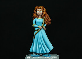
For Princess Merida's dress, I finally decided to go with a light turquoise/sky blue dress. It was either that or a dark teal dress which is actually the more accurate hue for the dress design as well as being a colour traditionally associated with the character as per in the movie posters. My decision was made with an eye towards making the miniature retain a more vivid colour scheme overall. Moreover, of all Princess Merida's costumes in the movie Brave, the light turquoise/sky blue one is my favourite.  

Princess Merida, latest progress on her dress and weapons
Decision was made to go with a light turquoise/sky blue dress with a yet-to-be designed freehand pattern
Red hair goes well with the light turquoise/sky blue dress

Each miniature has his or her own favourite paint line that complements their painting style. For me, I love how the Vallejo Model Color series enable me to paint smooth colour transitions and that paint line is fast becoming my favourite. That being said, the Reaper Master Series and Citadel paints come a very close second and third respectively. It's only after some time in the hobby I've come to realise there is no such thing as a 'best and only' paint to use but that it's more a case of using a paint line (or combination of a few) that best suits your own unique style of painting miniatures. So don't be influenced when someone says use only this brand. Instead, try it out first to see if it suits you.

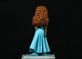
Side view reveals a surprisingly dynamic angle of Merida's dress
Folds on Merida's dress made painting shadows a breeze
Back view of my latest progress on the Princess Merida repaint project

Currently, the dress looks empty and is shouting out for some freehand patterns/designs to spruce it up. Although I will be using the dress patterns seen in the movie as reference, the final design will not be a pure replication of the original patterns. They will have to be modified and to a certain extent simplified in order to enable it to be painted freehand on a miniature. However, the texture and colours of the dress patterns will remain the same i.e. something approximating gold embroidery.

After painting Merida's dress, I've come to appreciate the level of dynamism inherent in the sculpture
Shadows lean towards turquoise while highlights approach light sky blue

In addition to Princess Merida's dress, I also painted up her weapons. Depending on how this repaint job progresses, I might feel confident enough to add some freehand designs to the bow. But for now, I will have to see how the dress freehand patterns/design turns out first. And before I can get started on that front, I will need to come up with some easy to paint patterns as well as watch tutorial videos of expert painters doing freehand painting. Thankfully, doing both should be fun activities for me.

http://shireworks.blogspot.com/https://www.facebook.com/shire.works

Wednesday 4 March 2015

Last Night on Earth - Star Trek Theme at Halfway Point

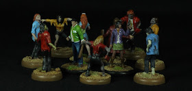
Any miniature painting project of mine that reaches the mid-point stage always gets its own group shot. These set of Starfleet Survivors and Zombies painted using pieces from the Last Night on Earth board game are no different. So without further ado, below are photos of the class of 1966 to '69. 

Last Night on Earth survivors as Star Trek characters Chekov, Uhura, Christine and Sulu (from left to right)

In this series of photos, I tried to compose a visual story of the foursome's first encounter with fellow crew members of the USS Enterprise who had been turned into zombies. Hope you like them. 

It was a dark and stormy night ...

Now that I have had some time apart from these finished pieces, they do look like they need more contrast, especially the zombies' clothing. Things weren't helped by the fact that I had to position the lights closer to this set of miniatures when the shots were taken, likely leading to overexposure. Regardless, I'm working hard to improve contrasts when painting light colours and I'm starting to (finally) have some success in this problematic area. Hopefully the next few work-in-progress miniatures I have on display will see some minor improvement in terms of contrast on clothing. 

Look out behind you!
Oops! Too late, the zombies are upon them ...
... and things look grim for the crew of the USS Enterprise

It's poignant that this post coincides with the recent passing of Mr. Leonard Nimoy, an actor who I have come to closely associate with the Star Trek franchise. This popular sci-fi universe is one of the few (if not only) TV/Movie series that chose to depict a positive view of humanity in the future. In reality, we are sadly too busy being offended by perceived insults and ever ready to hate things which we are ignorant of, don't understand or don't agree with. Whatever happened to live and let live?

http://shireworks.blogspot.com/https://www.facebook.com/shire.works