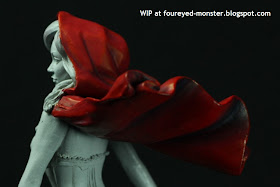
Of all the colours on the Nocturna Models Le Petit Chaperon miniature, red is to me the most important. Henceforth, every other colour I put on her will need to complement the shade of red I have painted on the hooded cloak. Targeting a hue between an intense bright red bordering on orange and an earthy brown red, I sought a middle ground that hopefully sees the red 'pop' without being too overpowering. I will only know for sure if I have achieved this after painting the rest of her.
 |
| Nocturna Models Le Petit Chaperon gets a splash of red |
To prevent an overdose of red I am limited the painting of this colour to only her hooded cloak, shoes and sock garters. Personally, I think painting too much red would overwhelm this miniature and make it look too one dimensional and flat. Moreover, she is Red Riding Hood not the Lady in Red.
 |
| Other than her iconic hooded cloak, Le Petit Chaperon has red shoes and sock garters |
 |
| Two sides of the red cloak worn by Le Petit Chaperon |
Previous blending and layering practice with red colours definitely helps as every new attempt sees smoother transitions from the shadows all the way to the highlights. It's not perfect yet but I'm getting there one layer (or is it blend) at a time. Red is a lovely colour to work with but hard to perfect.
 |
| Front view of the Nocturna Models Le Petit Chaperon, work-in-progress |
 |
| A dynamic sculpture of Red Riding Hood's hooded cloak made painting it a real pleasure |
To enhance the reds, I used blue shadows instead of black. I was fortunate enough to get hold of a really old White Dwarf magazine (WD362 February 2010) which back then had the excellent
Ask 'Eavy Metal articles, and this issue touched on the use of alternate colours as shadows for reds.
 |
| Blue shadows were used to give the reds some 'pop' |
 |
| Highlights looked yellowish hence were limited lest they reduce the hooded cloak's overall redness |
 |
| Best view of the blue shadows on Le Petit Chaperon's hood |
 |
| Le Petit Chaperon's blouse is screaming out for a sheer fabric treatment, tastefully done of course |
Meanwhile, her highlights were purposely limited to as few areas as I could get away with. I noticed that if I went crazy with the highlights, the cloak started to look more orange than red. At one stage I had to tone down the highlights with some mid-tone glaze. But that being said, there is a case to be argued for more highlights on her hood (not cloak) especially at the top most part.
 |
| It doesn't matter if it's Prada or Bata, red shoes are always hot |
 |
| Top view of Le Petit Chaperon's hooded cloak |
Also when painting the reds in Le Petit Chaperon, I changed my song playlist from its default blues setting to one with a variety of genres but still dealing with sadness and melancholy. Well it started super sad with one of my favourite country songs
Stay by Sugarland but ended in an upbeat song that was released when I was still in my mid-20's (deary me I feel old) i.e.
Kiss Me by Sixpence None The Richer. Both songs and the many in between set up a nice little mood progression for my painting session, transitioning from sad to happy. It never hurts to have good music to paint to!
 |
| Jennifer Nettles and Leigh Nash both offer contrasting skin/hair colour options as well as music accompaniment |
Incidentally, the lead singers of the respective music groups I
mentioned namely Jennifer Nettles and Leigh Nash also offer an
interesting contrast in skin and hair colours, one of which I may yet adopt for
Le Petit Chaperon. I leave you with this lovely line from a Sugarland hit ... 'I need a little less hard time, I need a little more bliss'; I hope you have less of one and more of the other in your life.


Red Riding Hood is so beautiful!
ReplyDeleteI agree ... definitely one of my favourite Nocturna Models figures.
DeleteGreat red on this cape !
ReplyDeleteIm 'enjoy to see the progression .
Thanks Vincent, lots more work ahead.
Deletethe cloak is wonderful!
ReplyDeletei think you are really great in creating contrast between dark and lighted areas.
the colour is already so alive that i'm really wondering how you will improve it!
i'm waiting to see more.
bye
Thank you for your kind words luca. I think the hood looks a bit dull so I might do a bit more work on it but I will leave the cloak alone for now.
DeleteThat really pops! make sure to keep you other colors cooler so they don't squash that nice saturation!
ReplyDeleteGood advice Zab ... I was just thinking the same thing i.e. using a bluish grey - as worn by Red Riding Hood in the movie starring Amanda Seyfried - on Le Petit's corset though I will let the idea mull around in my head for awhile to see if better alternatives present itself.
DeleteComing along really nicely! Good job on the red. You're right in trying to get the right balance of pop and blend, but looks like you're nailing it - again. interesting choice of music, btw
ReplyDeleteHeh heh ... my music tastes are varied. It was predominantly pop and country when I was young but then one day my dad brought me two cassette tapes from his travels i.e. 'Ugly Kid Joe' and 'Skid Row' and it was like a whole new whole was open to me. Soon I started listening to everything from hard rock, heavy metal, punk, bluegrass, jazz, blues. I particularly love music groups that are driven by drums and guitars and currently on my turntable (figuratively speaking of course as those babies cost a bomb) are The Band Perry's Pioneer and Paramore's Paramore. Phew ... now that was a huge mouthful of uninteresting facts about my music tastes ^_^ music always starts me rambling. XD
DeleteThat blue shading works very well. A great start.
ReplyDeleteThanks Finch ... I was lucky to have the old White Dwarf magazine for reference. I don't know if it's just me but the standard of painting in the magazines now are nowhere near the old 'Eavy Metal days.
DeleteGreat start, I like this type of red with contrasts towards the dark instead of cheerful ;)
ReplyDeleteHa ha ... yeah. Too red and she starts looking like a barbie doll. :)
Delete