Pages

Monday 26 September 2016

Portrait Practice #15 on Rey (Star Wars Force Awakens)

A year is a long time without drawing; for me it is anyway. Drawing is akin to riding a bike i.e. a skill you aren't likely to forget just because you haven't been doing it regularly. That being said, realistic portrait drawing is something you get good at only with regular practice. My drawing skills are rusty and it shows. Natural born artists are geniuses and as rare as they come. For the rest of us mere mortals, regular practice is the only thing that can result in better art. And practice I must.  

First graphite portrait in a year ... just glad to be drawing again

But strangely enough, for a piece that's one year too late I'm actually still quite happy with it. Despite over 365 days of neither acquiring any new skills nor honing any existing ones, I didn't wholly lose what I had previously learned. Some mistakes were repeated, some avoided. Inconsistencies abound but thankfully any skill regression was kept to a minimum. That's not saying much since I wasn't starting from a high base but a relief nonetheless for someone looking to progressively improve.  

Portrait Practice #15 on Star Wars The Force Awakens Rey as played by Daisy Ridley

Drawing an accurate and recognisable portrait is said to be one of the hardest things to do. Any little thing can make a portrait drawing look nothing like the subject matter in question. Even knowing that, I had for some unfathomable reason decided to shift the position of Rey's irises to show her gazing directly ahead instead of off into the distance like in the original reference image.  

Adjustments to the portrait meant Rey's eyes now stared directly ahead versus off into the distance 

This was a genuinely idiotic thing to do as it heaped more pressure on me to get the graphite blending/shading of the lights and shadows accurate enough to depict a face/neck that is tilted upwards and off to the side. Specifically to the image in question, the new location of the irises implies that Rey's facial plane was directly parallel to the drawing paper which isn't the case at all. These are some of the little things that make you go ... D'oh! ... Homer Simpson style. 

Portrait was completed with both traditional as well as mechanical pencils

In a way, I'm starting to feel constrained by the student grade papers I draw on. That could mean two things. The good - I'm improving. The bad - it's not the paper its me. A lot of top artists use smooth Bristol paper to draw realistic graphite portraits. Unfortunately, it's still too expensive for me to buy such drawing papers online due to prohibitive shipping costs. Instead, what I could do was source a possible equivalent - the Daler Rowney Smooth Cartridge Pad - locally. Going forward I will use both the existing Daler Rowney Graduate Pad as well as the new drawing pad to draw the portraits.   

Reference image/photo of Rey that was used for this practice session

In addition to my graphite drawing and miniature painting hobbies, I've also been bitten by the colored pencil bug. You heard right ... colored pencils. But not your low pigment school variety. It's the highly pigmented Sanford Prismacolor Premier (wax based), Faber Castell Polychromos (oil based) as well as Derwent Coloursoft (wax based) fine art pencils I'm talking about. There will be the usual bedding in period with a new art medium but it's going be a fun journey to complement what I already enjoy doing now. Life's all about the journey and I can't wait to get started on this one, with continuing progress on my other two hobbies of course. Hopefully, you'll join me for the ride!

Wednesday 21 September 2016

A miniature painting project for my mother-in-law

Surprised last week by a request from my mother-in-law to paint a figurine she had, I set about the task to - at the very least - do a half decent job that didn't elicit any major disappointment. With this not being a personal project that I could take my own sweet time on (read procrastinate), I imposed a time limit of one week to finish painting the figurine. Luckily for me, the previous week had two public holidays which equaled four full days (plus the weekend) of free time to paint. Working throughout the past week on the figurine, I must've put in about 35 hours or more on the paint job.  

A miniature painting project finished in record time for my mum-in-law
Main clothing comprised of a yellowish orange-blue green combo 
Base was in pastel-like hues of sky blue, light pink, yellowish green and neutral greys

A major difficulty I encountered in this sculpture was not truly being able to know where the outer robes began and the inner clothing ended. As such, I took creative license in order to have a fairly decent ratio of yellowish orange to bluish green on the main clothing. It was all tied up by a neutral ivory colour to counterbalance the darker hues on the said main clothing.  

Strap on the left shoulder was painted ivory to provide a subdued counterbalance to the main clothing's hues
Natural stone structure was the easiest to paint - just dry brushed layers of progressively lighter greys 
Under photographic lighting, the skin tone seems to become fairer than under normal daylight or fluorescent light

For the skin, I tried to simulate a fair East Asian look. It turned out a bit too fair especially under photographic lighting and more so when contrasted with much darker hues of the clothing. In future projects requiring such skin tones, I'll have to either reduce the saturation/intensity of the surrounding hues or experiment with Vallejo paints to come out with a new East Asian skin tone recipe.    

Curves on the waves and clothing neutralise the jagged stones thus providing an equilibrium of sorts
Waves on the base were the second easiest part to paint, followed by the lotus flower/seed pod
Figurine prior to it being primed or any paints layered on

One extremely positive thing I got from this project was the surprise at my ability to actually finish a miniature painting project within one week. Granted I didn't attempt any freehand design on the robes - which would have increased the time to completion - but hey, it's still a big deal for someone whose projects have been known to drag on to over a year or even mothballed. Now all that's left to be done is deliver the figurine to my mum-in-law. I can only hope that this eye opening experience of a quick paint-job-turnover will stand me in good stead as I resume my own drawing/painting projects.

http://shireworks.blogspot.com/https://www.facebook.com/shire.works

Thursday 15 September 2016

One year is a long time not to draw ... that ends now

Just recently I was asked to share a memory of something I posted one year ago on my Facebook. It was a graphite portrait drawing of Emily Browning as Babydoll in the movie Sucker Punch. Point being I had not drawn anything in an extremely long period. Any skill improvements I had made will likely have atrophied somewhat over the course of 12 months. It could very well be a case of one step forward two steps back though I'm hoping I can just pick up where I left off i.e like riding a bike.  

My last graphite portrait drawing was over a year ago

For my first graphite portrait drawing in aeons, I decided on Rey whom Daisy Ridley plays in Star Wars The Force Awakens. I chose a fairly low resolution photo of Rey which depicted her facial features in more of a no-frills variety akin to a photoshopped image with smooth skin tones. This should make it easier for someone like me who is resuming graphite portrait drawing after such a long time. Higher resolution images would've displayed details such as freckles and skin texture.

Rey (Daisy Ridley) is my first subject matter in my return to portrait drawing

Based on my experience so far, the most important step of the graphite portrait process is the initial faint line drawings. Bungle the line drawing and no amount of shading and blending will be able to create an accurate depiction of the portrait subject matter. And for portrait drawings, the only thing that really matters is the likeness to the subject matter that you're drawing. As such, I tried spending a longer than usual amount of time on the line drawing of Rey. I'm quite happy with it, to be honest.

Progress so far ... faint line drawing of Rey

There is a subtle difference between Rey in the reference photo and Rey in my line drawing. The latter has her centred irises looking straight at the viewer. But in the former, Rey is staring off into the distance (towards the top right corner of the paper). Perhaps in hindsight this wasn't such a smart thing to do as the rest of her facial features are angled upwards to the side. Changing her irises to stare straight ahead may distort proportions and make everything seem off. I'll have to be extra careful at the graphite shading/blending stage. Without the cue of off-centred irises, highlights and shadows on her face will take on greater importance in the portrayal of the tilt in Rey's head.   

Reference photo of Rey in a scene from The Force Awakens

Unfortunately, the JPEG image I used was smaller than I realised. A smaller file size (or lower resolution) equals less facial details. While doing the line drawing I noticed the shadows and highlights on Rey's face weren't clearly defined as I would've liked. This means I'll have to try and find a higher resolution image as reference for the graphite blending/shading process. But I'll be pushing ahead regardless as I aim to finish the portrait before the month is out. A three day stretch of free time coming up means plenty of drawing opportunities for me. Let's hope I put it to good use.

Friday 9 September 2016

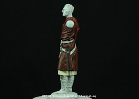
Game of Thrones Bronn (WIP - Clothing) aka 54 mm Nocturna Models The Crusader

It has been quite a while since I painted so much clothing in a miniature. Another recently completed Game of Thrones (GoT) project namely Princess Myrcella Baratheon - using the Dark Sword Miniatures Female Mage on Stairs as the proxy figurine - had clothing but most it was painted months earlier. Painting cloth comes with its own set of challenges but it actually isn't that different to skin tones. In the end, it's all about creating textures through paint to mimic real life surfaces.   

Nocturna Models The Crusader (54 mm) painted as Bronn, a sellsword in Game of Thrones

As a sellsword who first served Tyrion and later Jamie, Bronn needed a colour scheme to reflect his allegiance to House Lannister. Because the costumes that Jerome Flynn (the actor who plays Bronn) wore on set largely consisted of dark neutral hues such as greys or dull colours like browns and olive greens, I had to take some creative license with his clothing. Granted Bronn had on bright hues when he was betrothed to Lollys of House Stokeworth - light turquoise, bright greens and even yellows - but those are better suited to my Loki project. So in the end I went with dark red, reddish brown and ivory white; a colour scheme somewhat similar to a costume Jamie Lannister wore on Season 5. 

Bronn aka Nocturna Models Crusader, picture here with his left arm and yet to be painted scabbard
Lower right back area of miniature is arguably the best place to paint a freehand House Lannister lion

With Bronn's clothing looking rather bare, chances are high I'll attempt to paint the House Lannister heraldry freehand on some part of his clothing. Prior experience painting the heraldry on a warhorse caparison will hopefully stand me in good stead for the second attempt. Another issue I have is with the slight glossiness of the red gorget-like clothing around his neck (If anyone knows the definition of this Medieval clothing, do let me know). I tried matting the reds with Vallejo Matt Varnish but results were unsatisfactory. I then used Citadel Lahmian Medium with better but still mixed results.

Side view (right) - Bronn's clothing comprise of a red-reddish brown-ivory combination
Side view (left) - indentation on Bronn's left hip is where the scabbard will eventually be placed

I had second thoughts about using the Nocturna Models Crusader 54 mm resin figurine as Bronn seeing that this figurine was actually modelled after Baron Godfrey de Ibelin (Liam Neeson) from the movie Kingdom of Heaven. But the more I looked at it, the more I felt this figurine to be better suited as a proxy for Bronn. Not entirely accurate sculpt-wise as Jerome Flynn/Bronn but close enough for a carefully considered colour scheme to pull off a character doppelganger effect. 

Undergarment's main colour is ivory with white highlights and beige-grey shadows

Every miniature I paint seems to present a first-of-sorts for me and this figurine was no different. This was the first time I attempted to paint ivory clothing. I used a combination of grey and beige for the deepest shadows; ivory for the base colour; white for the brightest highlights; and lots of half-tones in between. Initially I used ocher for the deepest shadows to terrible results. It took me a while realise that ochre shadows weren't deep enough for ivory clothing. Moreover, the undergarment took on a yellowish tint which gave it an unappealing sickly look. So beige-grey shadows it was.

Reds of the gorget-like clothing symbolises Bronn's ties to House Lannister

Apart from the Lahmian Medium from Citadel, I used only Vallejo Model Color to paint Bronn's clothing. Next up will be the leather bits as well as metals on the miniature. While I'll revert to my trusted Citadel metallic paints for the latter, I'll be trying out the former with Vallejo paints for the first time. Hey, whaddayaknow. Yet another first. Until then, do enjoy your weekend.           

http://shireworks.blogspot.my/p/nocturna.html