Pages

Tuesday 29 April 2014

Experimenting with Water Effects and Realistic Water

At the back of my mind is this nagging itch to create and build a diorama that has lots of water. There is something about realistic looking water in miniature scale just seems so cool to me. Previously I had tried using epoxy resin to create a mini water diorama. This time around, I tried using a more user-friendly (and noob-proof) product to create a very quick and simple sea-themed base for yet another miniature I am working on, the Ax Faction Victorian Darling aka Kraken Hunter.

Creating a quick and simple sea-themed base Woodland Scenics products
Woodland Scenics Realistic Water (left) and Water Effects (right)

Step 1: A square piece was cut out from an IKEA cork pot stand for use as the base. I did toy with the idea of applying some plaster rolls on one side to prevent leakage of the Woodland Scenics Realistic Water through the cork. Instead, curiosity got the better of me and I went ahead without applying any plaster rolls on the cork's surface just to see if any leakage would occur.

It all starts with a cork base

Step 2: A basecoat of Citadel Ceramite White acrylic paint was applied on the cork base.

Basecoated in Ceramite White

Step 3: This was followed by a 50:50 mid-tone mix of Citadel Regal Blue and Mordian Blue paints.

Mid-tone was a 50:50 mix of Regal Blue and Mordian Blue

Step 4: Highlights was painted using different combinations of Citadel Regal Blue, Mordian Blue, Hawk Turquoise, Shadow Grey and Russ Grey. My aim was to create the colours of the sea.

Using blue, turquoise and grey to recreate the colours of the sea

Step 5: Using super glue, a 'fence' was build around the painted cork base in order to contain the Woodland Scenics Realistic Water when it is poured onto the surface of the painted cork base.

Creating a super glue fence to contain the realistic water

Step 6: Very minimal leakage occurred when the Realistic Water was poured into the 'fenced-in' area. However, enough of the Realistic Water had seeped into the porous cork (despite having a few layers of acrylic paint on it) that I had to pour an additional layer of the Woodland Scenics product onto the cork base, that is after allowing the initial layer to cure for 24 hours. The need for a second layer of Realistic Water could also have been required due to shrinkage of the initial layer.

Woodland Scenics Realistic Water was poured into the 'fenced-in' area
Close up of the realistic water effects after two layers, each curing for 24 hours

Step 7: After the two separate layers of Realistic Water had had time to properly cure (a total of 48 hours), I gently squeezed out some thin lines of the Woodland Scenics Water Effects onto the dried layers of Realistic Water. I then used a toothpick to rough up the lines somewhat to look like white caps on an ocean. The Water Effects were allowed to dry for 24 hours, after which it became clear.

Woodland Scenics Water Effects were added to the cured Realistic Water
Water Effects became clear after drying overnight

Step 8: Citadel Skull White was then painted onto the clear (and dry) Water Effects to make them look like white caps on an ocean. The overall effect could have been better if I had made the 'fenced-in' area deeper. But because this was a test piece, I had earlier decided to leave it shallow. 


Step 9: I placed the Ax Faction Victorian Darling aka Kraken Hunter's base on top to see how the whole thing would look like. It's painfully obvious that the whole thing will look better if I do not use the round plastic base. It's either that or paint the black round plastic base in ocean colours.

Losing the round plastic base will make things more realistic
Pieces of the Ax Faction Victorian Darling aka Kraken Hunter

Ax Faction's Victorian Darling has fantastic details and is already looking like a fun piece to work on. At this stage, I still have no idea what colours she or the kraken tentacles are going to be. For sure it will have to be something that goes with the greenish blue of the ocean. Decisions, decisions!

http://shireworks.blogspot.com/p/ax-faction.html

Friday 25 April 2014

Le Petit Chaperon [WIP - 2 B's and a colour scheme]

Shifting between two projects of hugely contrasting scales - Kingdom Death White Speaker's 35-mm versus Nocturna Models Le Petit Chaperon's 80-mm - has become less disorientating for me as I get used to the idiosyncrasies of the differently sized miniatures. More importantly, both miniatures regardless of their scale, have been extremely fun to work on so far.     

Using Amanda Seyfried's Red Riding Hood as an inspiration for Le Petit Chaperon

For Le Petit's colour scheme, I sought inspiration from the 2011 film Red Riding Hood starring Amanda Seyfried, which was loosely based on the original French folktale. Three predominant colours in this scheme are red, white and greyish blue. With Nocturna Model's version of Red Riding Hood being sexier than the movie version, the greyish blue bodice covering Amanda is now a corset on Le Petit and Amanda's white blouse looks more like a sheer lingerie on Le Petit. The only red on Le Petit will be her hooded cloak, shoes and maybe red ribbons on sheer white stockings. As for her hair, it will likely be bleached or golden blond, which should go well with either fair or rosy skin.

Likely colour scheme for my version of Le Petit Chaperon
While I may not have the luxury of painting Le Petit Chaperon with an air brush, I am nonethelss relishing the challenge of painting smooth layers for such a huge model by using just nylon brushes with perhaps a little help from a Kolinsky sable brush for fine detail work. In hindsight, the 6/0 brush I have may be too small and its use is likely limited to just her eyes. As the Nocturna Model figure is the most ambitious work I have attempted to date, I could yet be tempted to invest in a larger-sized Kolinsky sable brush for (less fine) detail work such as possible freehand designs on her stockings.

Base and basket (2 B's) of Le Petit Chaperon
Le Petit's base turned out to be a prime candidate for drybrushing as it smartly sculpted with many edges that easily caught highlights from a brush loaded with paint straight from the pot. I wasn't too sure what the 'long wavy parts' of the base were, so I just assumed they were grass and drybrushed accordingly using green hues. Painted earlier, the puppy was added to show relative size. 

Base of the Nocturna Models Le Petit Chaperon
Overhead view of the base showcasing the ground and what I presumed to be sculpted grass

Additionally, I managed to complete a quick paint job on Le Petit's basket of goodies. So in essence, I have completed all of the 'outer parts' of the miniature except for the dog leash. However, the next step will likely be Le Petit herself starting with the challenge of painting her skin showing through sheer fabric. At this point in time I have no idea if I can pull it off but I plan to try regardless.

Le Petit Chaperon's picnic basket - I wonder what goodies are insid

Le Petit Chaperon is one miniature that I want to really take my time on so as to do the best job I can with my current skill level. With that goal in mind, I plan to work on a few miniatures concurrently in order to alleviate the tedium that can somtimes arise from looking at the same miniature for too long. It's the old cliche of too many miniatures too little time but definitely a good problem to have. 

http://shireworks.blogspot.com/p/nocturna.html

Monday 21 April 2014

Kingdom Death White Speaker [WIP - Skin tones, so far]

For some time now I have been pretty unhappy with the skin tones of miniatures I have painted. I am aware that, on occasion, they lack contrast that make skin pop. To get over this mental block that seems to be hindering my progress as a miniature painter, I decided to paint up a miniature with the main objective of achieving deeper shadows and brighter highlights for the skin tone. 

Kingdom Death White Speaker [WIP - skin tones]

To try and make further progress on the painting realistic skin tones, I had a look at some miniatures in my collection to find one that showed a lot of skin. What I found was a 35-mm scale Kingdom Death resin miniature namely the White Speaker, which I thought would be suitable for my purpose. I had primed this miniature way back when I was still fairly new to the hobby and kinda botched up the prepping stage in my impatience thus resulting in rough looking skin on her arms.  

She was a perfect specimen for more painting time on skin tones, for obvious reasons

For a white Caucasian skin tone, I used mainly Reaper Master Series Paints (MSP) and it was based on a paint recipe formulated by one of my favourite miniature painters i.e. Jennifer Haley (the other favourite being Marike Reimer). I find that my style of painting is rather similar to both painters. But of course, on a scale of 1 to 10 with the latter being the best, both are a perfect 10 while I am at 1, that is I feel about nine whole levels away from these two wonderful painters on a scale of 10.   

Kingdom Death White Speaker - [WIP skin tones, side view from left]

At this stage, I don't necessarily feel that I have completed the skin tones of the Kingdom Death White Speaker. I am still contemplating a further increase in the contrast of her skin tone. Other possible touch ups might include trying to clear up an unfortunate wash ring and perhaps smoothening out the transitions between shadows and mid-tones in certain parts of the skin. As for chalkiness in the highlights, I am afraid that is most likely beyond my skills at the moment.

With armour like that, no male warrior stood a chance against the White Speaker

Light skin tones continues to be a challenge to me as chalkiness is still apparent at very up close - especially the highlights. Lighter colours are often more susceptible to chalky results than darker colours. Based on what I understand, the light skin tones can become chalkier for a number of reasons such as being thinned too much or having paint dry slightly on the brush before application. But on the bright side, the level of chalkiness I get is reducing although I have yet to hit the sweet spot of a perfect smooth porcelain-like skin tone without the benefit of a wash. 

"Is my butt too big?" ... a question many warriors dare not reply

Missing from the photos are the White Speaker's spear and her cloak. Personally, I don't really think the cloak goes well with the miniature. However, I will paint it up later and stick it to the miniature using blue tack to see how it looks before making the final decision on whether to keep the cloak.

Her hair is also nicely sculpted ... question is, will she be a blonde or red head?

Other than painting the Kingdom Death White Speaker's skin tone, I also blocked in the leather (or is it cloth) straps that serve as armour with a Reaper MSP Brown Liner diluted with water. Officially her armour ... and I used that term lightly ... is white in colour though I am toying with the idea of using light blue. Specifically, sky blue would look good if I make her a blonde.

Kingdom Death White Speaker - [WIP skin tones, side view from right]
A very dynamic pose ... and in high heels too

This Kingdom Death miniature saw me taking a short break from a much bigger miniature I am also currently working on, namely Nocturna Models's Le Petit Chaperon. To give you an idea how small the White Speaker is, I took a shot of her next to a paper clip and a Malaysian five sen (cent) coin.

In the grand scheme of things, she does look rather petite

To get myself out of a rut (I have not been improving as well as I hoped), I needed to remind myself of the level to which I aspire to - for example the miniatures that placed first and second in the Best of Show Crystal Brush 2014. To paraphrase a recent battle cry by the captain of a football team I have supported since before my teens - the completion of every miniature I paint is followed by an attitude that it's done and finished. Then it's time to move on to the next miniature and start again. There is a lot of improving I need to do but the fun lies in the journey which I hope will be a long one.

http://shireworks.blogspot.com/

Thursday 17 April 2014

Dry taps, moist eyes

Far from being a Hollywood cliche of a Chinese saying, the title of this blog post just about sums up the situation I find myself in with regards to my miniature painting projects and drawing practice sessions (in preparation for future sculpting concept sketches). One good, the other not so good.

Dry taps equals slower progress on miniature painting projects

Dry taps
Despite the onset of the rainy season, the preceding spell of dry weather had lowered water supply levels in dams of water treatment plants to critical levels. This meant water rationing was enforced in the city and dry taps for up to 20 days per month, with supply switched on only one every three days. I tend to use more water than the average painter because I like to keep my water pot clean when painting. All I can do is to store some water that will hopefully get me though the 'dry days'. 

Some 5-litre bottles filled with water to enable painting during dry days

Moist eyes
Meanwhile, I went back to basics for my drawing practise sessions as I had mixed feelings about my previous drawing. Just when I felt I had made progress on the rendering of hair and mouth (to capture a smile) in my drawing, I kinda regressed on the drawing of eyes. In my Portrait Practice #09, the eyes looked flat and spoiled the hard work I had put in on the hair and smile. To try and improve, I practised drawing the eyes of two actresses - one from the past with dark coloured irises and one from the present with more lightly coloured irises. Can you guess who they are? Hints are in the quotes they made in performances that won them their first Oscar Best Actress Awards.

Drawing practise - Dark coloured irises
"What the world needs is a return to sweetness and decency ..."

For this drawing practise session, I made a conscious effort to paint realistic looking eye pupils and irises as well as tried to do a better job of shading areas around the eye lens so that the eyes don't look too flat in a portrait drawing. I also tried to draw more realistic looking eyebrows and eyelashes.

Drawing practise - Light coloured irises
"You might not have experienced the shit I did, but you loved hearing about it didn't you?"

At the moment, I can't seem to get everything right in one single drawing. For my first drawing (eyes from an iconic class act from the past), I managed to get the proportions and shading around the eyes relatively spot on but (there is always a but) I felt the pupils and irises just did not have enough life in them, for want of a better description. In my eye rendering of a more contemporary movie star, I think I nailed the moist and 'live' look of the eyes' pupils and irises but (again with the buts) I got the proportions all wrong. To see who the eyes belong to, please scroll down to the bottom of this post.


So have you guessed who the actresses are? Well, the first is one of my favourite actresses of all time, Audrey Hepburn while the second is the actress that will likely be the subject of my first sculpting project, Jennifer Lawrence. Thanks for reading my latest blog post and here's to wetter days ahead.

Saturday 12 April 2014

Knight Models Logan aka Wolverine [Completed]

First glimpsed in Marvel's 1974 comic The Incredible Hulk #180 and then premiering in a full appearance an issue later (#181), James Howlett aka Logan aka Wolverine has since become a firm favourite for many comic book fans, yours truly included. You just gotta love his leave me the hell alone and go [bleep] yourself attitude. I was pleased to finally get the chance to paint him for my Marvel Universe miniature project. Not sure if I did it justice but I certainly had a lot of fun trying.  

Knight Models Logan aka Wolverine
Those adamantium claws are looking pretty sharp

There was actually a few firsts or sorts for me in the painting of this miniature, chiefly among those are the denim texture, cotton singlet texture, skin tones incorporating veins (more of this later in the post) and also forearm hair. Yup, you read that right ... forearm hair. With more experience under my belt, I felt more confident tackling this hair-raising challenge (groan). For this attempt, I mixed hair colour with the skin tone colour and painted very light strokes on the forearm. It helps to think of forearm hair more in terms of texture rather than individual strands. I also applied skin tone glazes in patches to mute the forearm hair colours - in places where my strokes were a tad too heavy-handed.   
Hugh Jackman's ... errr Logan's forearm hair might be sexy to girls but it was a pain to get right
Knight Models Logan aka Wolverine (back view)

As part of my goal to improve my painting, I diverged from my usual skin tone recipes and added some greens and blues to the mix in order to simulate the existence of green and blue veins under our skin. However, the green and blue hues I added aren't very noticable in the photos partly due to the lighting. Additionally, I tried to apply the shadows, mid-tones and highlights in such a way that hint at a very buff physique ala Hugh Jackman, the actor that plays Wolverine in the movies.

Skin tones with the addition of green and blue hues

Due to the way Logan's forehead was sculpted and the downward angle of his head, the left eye was covered partly in shadows in most of the photos. To get a better view of Logan's eyes, I took a photo from a slightly different angle (see below). I was feeling a bit 'out of it' when painting Logan's eyes, so they are definitely not one of my better works. Might still revisit them to paint the pupils smaller but for now I am too lazy to make any changes. Moreover they actually look way more decent up close in real life as opposed to the magnified photo of a DSLR macro lens shot. Just saying, that's all. 

A different angle of Logan's face, which has a better view of the eyes

Logan's hair was painted black although on occasion I thought they looked more brownish than black in the movies while the claws were given just a black wash and highlighted to simulate sharp blades. Adamantium - in the movies - to me has a very simple clean look to them and as such I felt that it needed only a black wash and did not require additional washes such as blue or purple.

Denim jeans goes best with a white top
Biceps, triceps ... all buffed up like Hugh Jackman

All in all I am pretty contended with the results. If push comes to shove, I guess I could do further work on the white singlet, the borders between the skin and singlet, the eyes and yet more contrast to the skin. But being a minimalist (call me Mr. IKEA why don't you) I always try not to overpaint.

Belt buckle isn't entirely accurate as the original is supposed to be yellowish-orange like gold
Knight Models Logan (Front view)


360 view of Knight Model's Logan aka Wolverine
For a 360 degree view of the Knight Model Logan 1/28th scale miniature, please check out the video below. For other videos, do check out my YouTube channel FourEyedMonster Miniatures. Be sure to choose the high definition (HD) option when viewing the YouTube videos for maximum quality.


Thanks for following my progress on Logan, the second piece in my Marvel Universe miniature painting project. Have yourself a good weekend, and may your brushes always be pointy.

http://shireworks.blogspot.com/p/knight-models.html

Monday 7 April 2014

Capturing a smile for Portrait Practice #09 and some clay sculpting tools at last

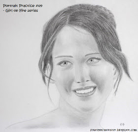
Capturing a smile was first and foremost in my mind when attempting my latest portrait pencil drawing. The next two objectives was improving my skin tone shading as well as getting hair to look darker and messier. Sticking to the theme of drawing what could be my potential sculpting subjects, I again drew (pun unintended) inspiration from The Hunger Games 'Girl on Fire' scene. Specifically, I used a photo reference of Katniss Everdeen (Jennifer Lawrence) responding to a comment made by the Hunger Games talk show host, Caesar Flickerman as played by actor Stanely Tucci. 

Portrait Practice #09 - Capturing a smile (Sculpting concept sketches - Girl on Fire series)
Reference photo used in my latest portrait drawing practice -  a scene from The Hunger Games

While I have been trying out charocal pencils and willow charcoal sticks in my practice sessions invloving just the drawing of hair, I do not yet feel comfortable enough in their usage to apply them in my latest portrait practice session. As such, this latest portrait drawing was completed using graphite pencils only. In order to get the hair to look darker, I incorporated the use of a Staedler 8B pencil which had very good matte black qualities. To try and simulate realistic hair, I also drew random wisps of hair and paid close attention to how the flocks of hair interacted with one another.

Not entirely an accurate likeness as I compensated for heavy shadows on the face

Once when referring to a Games Workshop 'Eavy Metal miniature painting guide in an old White Dwarf magazine, I came across advice which made mention of how a slightest change in highlights can determine a miniature's facial expression. To be honest, I never truly grasp the relevance of this advice until I started drawing portraits using just tonal values. That in essence is what makes getting a likeness in portrait drawings so difficult for me. Getting a shading slightly off for a facial feature and the portrait ends up looking like the sister of the subject matter or turn what was suppose to be a radiant smile into an uncomfortable grimace - in other words, close but no cigar! 

Original photo of drawing, shown here against a high contrast adjustment made using MS Picture Manager

Without access to a scanner for this drawing, I had to settle for the next best thing which was taking a photo of my drawing using a DSLR camera. Due to the A3 size of my drawing pad, placing the drawing in my usual photography set up is sadly not possible. So without the help of lighting from my IKEA lamps, I relied solely on daylight as my light source to mixed results. On most occasions, the photos I take of my drawings usually end up looking too dark thus negating the contrast in tonal values I had shaded. I made corrective adjustments using the Microsoft Picture Manager program.  

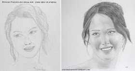
Looking back at my first portrait drawing versus the level I am at currently

As the saying goes, the proof is in the eating of the pudding, so I referenced my latest portrait drawing against the first one I did late last year to see if I had improved at all. I guess it's safe to say that I am making some progress although there is definitely still a lot I can do better. 

Finally, some clay sculpting tools

Pro Art 14-piece clay tool set with case
Inside the set is a mixture of metal and wooden tools

On the sculpting front, I got a very good deal for a clay tool set from Amazon. Although there are still materials I need for a proper figure sculpting project such as armature wire, I do have the basic stuff which would allow me to try sculpting a head or face. That is a good place as any to start my journey into sculpting as I would love to sculpt a bust in the future anyway. But I am getting ahead of myself ... first I need to find out what each tool is used for. Either that or just wing it and see what I come up with. Who said playing with plasticine in kindergarten decades ago wouldn't amount to anything.