Sand snakes are synonymous with House Martell so it was a no-brainer to select a Bretonnian Knight with a snake/serpent helm to represent one of the great noble house of Westeros. While sand snakes normally exist in yellowish brown hues, creative license meant green was chosen instead to contrast the predominantly orange colour scheme. Yellow and blue wash on metal made up the rest.
 |
| House Martell Knight work-in-progress, a closeup of a 'sand snake' atop the helm |
Having watched House Martell come to prominence in Season Four of Game of Thrones, I was largely influenced by the costumes of Prince Oberyn Martell and his paramour Ellaria Sand. Because Prince Oberyn's entourage was decked mostly in yellow, it made me doubt my initial choice of an orange colour scheme. But closer inspection of everything House Martell in the
Game of Thrones HBO series revealed an interplay between yellow, orange and every hue in between. Hence I made a slight adjustment to my original choice by making the orange lighter to mimic the colours on TV.
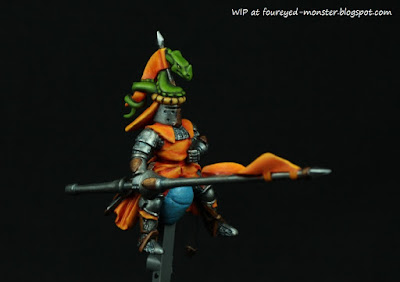 |
| My version of a Martell knight has a colour scheme dominated by orange, yellow and green |
 |
| Getting smooth blends was much easier for green than orange |
 |
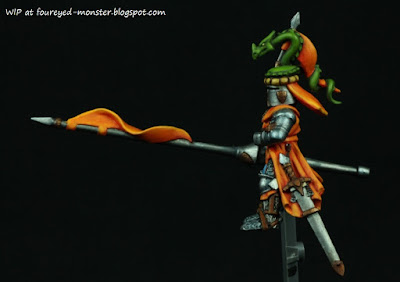
| Side view (right) of the House Martell Knight |
 |
| Apart from the 'sand snake', I achieved fairly smooth blends on the helm banner and lance |
Getting a smooth transition for the orange hues was difficult which made blending work on the greens of the 'sand snake' seem almost too easy in comparison. For both colours, I made use of
Vallejo Model Color (VMC) acrylic paints as I find them relatively easier to blend smoothly. I love the amount of green as well as orange/red/yellow hues available from the VMC line. That and its consistency allows me to make half tones of half tones for that extra smooth transition between hues.
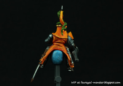 |
| Back of the Martell Knight had the darkest orange hues |
 |
| A horse! A horse! My kingdom for a horse! |
 |
| Side view (left) of the House Martell Knight |
 |
| A blue wash was applied to the knight's armour for that 'extra' shine |
A piece not shown above was the knight's shield. Thus far it just lacks the House Martell heraldry which is a red sun pierced by a golden spear. I have yet to create a design simple enough to be painted freehand on the miniature. That should be the final step prior to completing the paint job.
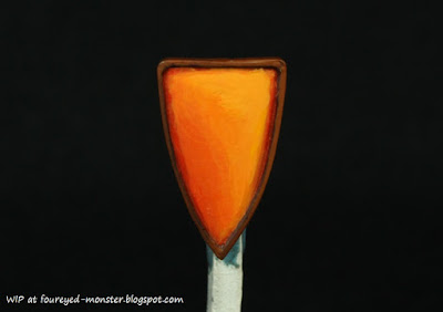 |
| Shield with the House Martell heraldry/symbol yet to be painted on it |
In addition, I reworked the House Martell warhorse so that it now looks much brighter. Extreme highlights are now a pure yellow instead of the previous light orange. Inclusion of the red sun/golden spear heraldry may yet change the dynamics of the overall colour scheme ... time will tell.
 |
| House Martell Warhorse sans heraldry work-in-progress |
 |
| Warhorse had its overall scheme brightened up a notch towards yellowish orange |
Time off from this piece has gotten me excited about it again. Hopefully it will spur me on to figure out how to paint the heraldry freehand. You might be wondering what has happened to the red dragon in my previous post. Well similarly as I'm wont to do, projects tend to be left to gestate for a while before I return to finish them. I find that this allows me to spot mistakes I may otherwise have missed as well as view the miniature from a newer perspective. The latter could cause an adjustment to the colour scheme; the point being moving from project to project keeps things fresh. And having a fresh approach can sometimes make or break the miniature painting project we have spent an eternity on.


.jpg)

Great choice of colours, waiting for more!
ReplyDeleteThank you Luca. It should be complete once I figure out how to pain the heraldry.
DeleteLovely painting and colour work. :)
ReplyDeleteThanks pulpcitizen :)
DeleteBeautiful colours. Looks superb.
ReplyDeleteThank you Simon. There is still the heraldry to be added ... I'm hoping it doesn't change the dynamics of the piece too much.
DeleteThat is simply sensational, amazing job on the blending. I find working with orange and yellow difficult, which makes his post all the more inspiring.
ReplyDeleteThank you so much Michael. I agree ... working with orange especially is pretty tough. I need more patience i.e. thinner layers of paint to really get that smooth blend but I'm still too impatient. The mind knows what to do but the hands just won't do them. :)
DeleteSoo beautiful! I love how you treat colours and how you blend them. Marvellous! Totally worth of the Martells!
ReplyDeleteMany thanks Suber. Oberyn Martell is pretty boring ... I much prefer the sand snakes!
DeleteHow the hell is that you manage every time to surprise me with your palette? I would never, never choose green with orange but I do love the result you had with these two colours!
ReplyDeleteI wish I could take credit but this colour combo is rather ubiquitous. If you seen a red haired (i.e. orange) actress on TV, look closely and you will notice she likely has a blue or green dress on. Contemporary examples being Poison Ivy (from the Batman universe), The Mysteries of Laura (a comedy drama on TV) etc.
DeleteThat orange is amazing!
ReplyDeleteThanks a lot Ace!
Delete